Picture this: you try on a coral blazer at the store and your face suddenly looks awake. Your eyes brighten. The cashier asks if you’ve been on vacation. That’s not flattery — that’s your coloring meeting its match. If clear, clean, vivid colors do this for you, there’s a strong chance you’re working with a bright spring color palette, and once you learn how to use it, getting dressed gets a whole lot easier.
Bright spring is one of the most striking seasons in the 12-season system. The colors are warm, saturated, and full of light — think tropical fruit, fresh flowers, candy-bright pops that look amazing on someone with golden warmth in their skin and brightness in their eyes. Let’s walk through what this palette actually looks like, who it suits, and how to wear it without feeling like a walking highlighter.
What Is a Bright Spring?
In personal color analysis, bright spring sits on the cusp between the spring and winter families. You get the warmth of spring — that golden, sunlit quality — combined with the high contrast and saturation typically associated with winter. The result is a palette that’s warm but punchy, clear but never muddy.
Bright springs are sometimes called “clear springs” depending on the system, and the two terms refer to the same coloring: warm undertones plus high chroma. If you’ve ever looked at a soft pastel and thought “that’s pretty, but it washes me out,” and then put on a hot pink and felt instantly alive, that’s the bright spring instinct talking.
The Three Defining Qualities
- Warm undertone — there’s gold, peach, or honey in your skin rather than rose or blue
- High chroma (brightness) — your features have clarity; muted colors flatten you
- Medium-to-high contrast — your eyes, skin, and hair have noticeable difference between them
According to personal color analysis methodology, the season you fall into depends on three dimensions: hue (warm vs cool), value (light vs dark), and chroma (bright vs muted). Bright spring lands on warm, medium value, and very bright.
How Do You Know If You’re a Bright Spring?
This is the question that brings most people to color analysis in the first place. Here are the markers that usually show up together. You don’t need every single one — but if four or five sound like you, it’s worth a closer look.
Skin
Bright spring skin usually has a warm, golden, or peachy cast. It often tans easily without much redness. Freckles are common. Even on deeper skin tones, you’ll see warm undertones — caramel, copper, golden bronze. The skin tends to look luminous in natural light rather than matte or chalky.
Eyes
Eyes are typically the giveaway. Bright springs often have clear, jewel-toned eyes: bright blue, turquoise, warm green, or topaz brown. There’s usually a defined ring around the iris and visible flecks. Eyes have a sparkly, almost glassy quality rather than a soft or smoky one.
Hair
Natural hair color tends to be golden blonde, strawberry blonde, warm light to medium brown, or a rich auburn. On deeper skin tones, hair can be deep brown with warm reflections in sunlight. You almost never see ash tones in a true bright spring’s natural hair.
The Coral Test
Hold a coral or warm peach top up to your face in natural daylight. Then try a dusty rose. If coral makes you look brighter and rose makes you look tired, you’re warm and bright. If both look fine, you might be a neutral season instead.
The Bright Spring Color Palette in Detail
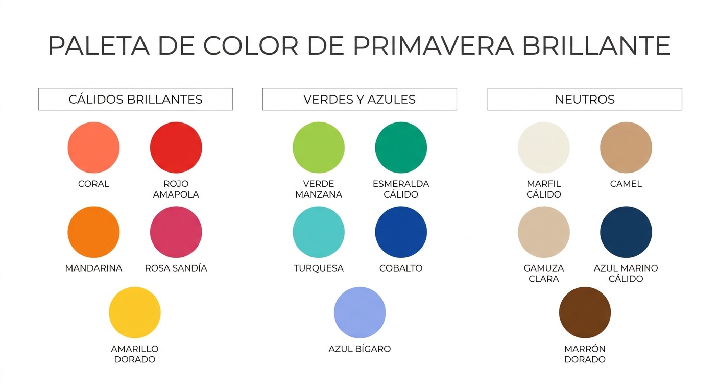
Now for the fun part. Bright spring colors look like a fruit stand in July: clear, juicy, and full of energy. The whole palette feels like sunshine bottled up. Here’s how it breaks down by family.
Warm Brights
- Coral and warm peach
- Bright poppy red
- Tangerine orange
- Warm hot pink (think watermelon, not bubblegum)
- Golden yellow and buttercup
Greens and Blues
- Bright apple green
- Emerald with a warm lean
- Turquoise (a hero color for this season)
- Warm cobalt blue
- Periwinkle on the warmer side
Neutrals That Actually Work
One of the hardest parts of being a bright spring is realizing your “safe” neutrals aren’t black, navy, or gray. Those drain you. Your real neutrals are warmer and lighter.
- Warm ivory and cream (skip stark white)
- Camel and warm tan
- Light warm gray with a beige cast
- Bright warm navy (not the dusty kind)
- Golden brown
Colors to Avoid
Bright spring goes wrong with anything dusty, muted, or icy-cool. Black is the big one — it overwhelms the brightness in your face and creates a harsh shadow under the chin. Burgundy, mustard, olive, and any color described as “dusty” or “smoky” will flatten you.
A Quick Reference Table
| Category | Bright Spring Yes | Bright Spring No |
|---|---|---|
| Reds | Poppy, coral red, watermelon | Burgundy, brick, oxblood |
| Pinks | Hot warm pink, peach, salmon | Dusty rose, mauve, blush |
| Blues | Turquoise, warm cobalt, bright periwinkle | Navy black, slate, denim wash |
| Greens | Apple, warm emerald, bright kelly | Olive, sage, forest, hunter |
| Neutrals | Warm ivory, camel, light tan | Black, charcoal, cool gray |
| Metallics | Bright gold, warm rose gold | Silver, pewter, antique brass |
Building a Wardrobe Around the Bright Spring Color Palette
Knowing your colors is one thing. Putting them on your body day after day is another. The trick with bright spring is balance — you can absolutely wear vivid colors head to toe, but you can also build a wearable, professional, real-life wardrobe that doesn’t look like a fruit basket.
Start With Your Base Layers
Your foundational pieces — jeans, basic tees, work pants, jackets — should come from your warm neutral range. Camel trousers, a cream blouse, light warm denim, and a warm tan blazer will pair with almost anything else in your palette. Skip the black trousers you’ve been buying out of habit; warm navy or chocolate brown will serve you so much better.
Bring the Color In Through Statement Pieces
A coral sweater. A turquoise scarf. A poppy red bag. These are where bright spring sings. If you feel hesitant about wearing a lot of color, start with accessories — a bright watch strap, a warm pink lipstick, gold hoops — and work up from there. You’ll notice people complimenting your face, not just the outfit.
Mix Two Brights at Once
Bright spring is one of the few seasons where you can wear two saturated colors together and look intentional rather than chaotic. Try coral with turquoise. Apple green with warm pink. Golden yellow with bright cobalt. The palette is built to play with itself.
Hair, Makeup, and Jewelry for Bright Springs
Color analysis doesn’t stop at clothing. The colors near your face — including your hair color, your lipstick, and your earrings — make a bigger difference than most people realize.
Hair
If you color your hair, lean warm and bright. Honey, golden blonde, warm auburn, and warm chestnut all work beautifully. Ashy or cool-toned dye jobs will fight your natural coloring and age you. If you’re going gray, a warm-toned highlight can soften the transition without pushing you into cool territory.
Makeup
- Lipstick: coral, warm pink, peachy nude, true warm red
- Blush: peach, apricot, warm pink
- Eyeshadow: warm browns, golds, soft turquoise, peach
- Foundation: anything with a yellow or peach undertone, never pink-cool
Jewelry
Gold is your friend — bright yellow gold, polished rose gold, or warm mixed metals. Silver tends to look cold against bright spring skin. If you love silver, look for warm-tinted versions or wear it alongside gold pieces to bring warmth into the mix.
Bright Spring Celebrities and Real-Life References
It helps to see the palette on real people. Some commonly cited bright springs include Drew Barrymore, Gwen Stefani in her natural coloring, Zendaya in many of her warm-toned looks, and Cameron Diaz. Notice how often these women appear in coral, turquoise, warm pink, and golden tones — the stylists know what they’re doing.
For inspiration boards, fashion editors at Allure and similar publications often feature bright spring palettes during spring and summer issues. Pay attention to which models look genuinely lit up by a color versus simply tolerating it.
What If You’re a Bright Spring on a Budget?
You don’t need to overhaul your closet in one weekend. That’s stressful and wasteful. Here’s a more realistic approach.
- Audit what you already own. Pull every top out of your closet and sort into “lights me up” and “drains me.” Be honest. You’ll see a pattern fast.
- Donate or sell the drainers. If a piece consistently makes you feel dull, it’s not going to magically start working. Free up the space.
- Replace slowly with palette colors. The next time you need a basic tee, buy it in warm ivory instead of white. The next sweater, in coral instead of dusty pink.
- Prioritize face-framing pieces first. Tops, scarves, jackets, and earrings have the biggest impact. Bottoms matter less.
- Save the splurge for a statement coat or blazer in a true bright spring color — it’ll get years of wear.
If you want a structured starting point, our free color and style analysis is a useful way to confirm your season before you start spending. Knowing for sure beats guessing every time you check out online.
Common Mistakes Bright Springs Make
Wearing Too Much Black
This is the big one. Black has been sold to us as universally flattering and professional, but for a bright spring, it creates harsh contrast that pulls focus away from your face. If your workplace requires dark colors, swap to warm navy, chocolate brown, or charcoal with a warm cast.
Defaulting to Pastels
Light spring and bright spring are often confused. Both are warm and light-ish, but bright spring needs saturation. A pale baby pink will wash you out, while a hot warm pink will make you glow. If a pastel feels “fine but flat,” that’s why.
Mixing Cool and Warm Without Thinking
A cool gray blazer over a coral top can look disjointed. Keep your undertones consistent across the outfit — warm with warm. If you need to wear a cool piece for some reason (work uniform, wedding dress code), keep it as far from your face as possible.
Ignoring Hair Color
You can wear the perfect palette and still look off if your hair color is fighting you. Ash blonde or cool brunette dye jobs are one of the fastest ways to make a bright spring look tired. Always go warm.
Seeing the Palette Against Your Skin
Reading about colors only gets you so far. The moment you put fabric near your face and compare options side by side, the answers become obvious. This is exactly why professional draping exists — and why image consultants invest in real fabric tools rather than relying on screens.
If you want to test the palette properly at home or you’re a stylist building your kit, our Four-Season Color Analysis Drape Set ($119) lets you compare the four seasons against your face in natural light. It’s the difference between guessing and knowing. Pin a drape under your chin in front of a mirror and you’ll see your skin either clear up or go gray within seconds.
How Bright Spring Differs From the Other Springs
The spring family has three members, and they’re often mixed up. Here’s how to tell them apart.
- Light spring: warm but soft and pale. Pastel-friendly. Lower contrast features.
- Warm spring: warm and medium-bright, but more golden and earthy. Less neon, more honey.
- Bright spring: warm and very saturated. High contrast. Tropical and vivid.
If you’re someone who looks washed out in pastels but also overwhelmed by deep autumn colors, bright spring is likely your home. The brightness is non-negotiable for you — soft colors will always look “off” no matter how flattering they seem on someone else.
A Final Word on Wearing Your Colors With Confidence
The point of knowing your season isn’t to limit you. It’s to make every purchase, every outfit, and every morning easier. When you stop fighting your natural coloring and start working with it, your wardrobe shrinks but your style sharpens. People will notice you, not your clothes — which is exactly the goal.
Bright spring is, frankly, one of the most fun palettes to wear once you commit to it. There’s joy built into these colors. You’ll catch yourself smiling more in coral than you ever did in beige. That’s the whole point. So if you’ve been quietly suspecting that the bright spring color palette is yours, take it as a sign — pull out that turquoise scarf, swap the black sweater for warm ivory, and watch what happens the next time you walk past a mirror.