Picture your first client walking into your studio. She’s nervous, a little skeptical, and holding the gift certificate her sister bought her three months ago. The next ninety minutes need to feel like magic — and the gear on your table is what makes that magic repeatable. A solid color analysis kit isn’t about owning every shiny tool on the market. It’s about owning the right ones, in the right order, so you can focus on your client instead of your setup.
If you’ve been piecing things together from craft store fabric and Pinterest screenshots, this is your permission slip to stop. Let’s talk about what actually belongs in your kit, what you can skip, and how to build a setup that grows with your business.
What a Color Analysis Kit Really Is (and Isn’t)
A kit isn’t a single box you buy once. It’s a working system — fabric, light, framing, and reference material — that lets you draw a clear conclusion about a client’s season in under two hours. The pieces have to talk to each other. A gorgeous drape set under a warm yellow ceiling bulb will lie to you. A great lamp paired with mismatched fabric scraps will too.
Think of it like a chef’s mise en place. Everything visible, neutral, and ready, so the actual analysis becomes the only thing you’re thinking about. According to the overview on personal color analysis, the methodology depends on observing how skin, eyes, and hair respond to specific hues — which means anything that distorts those observations is working against you.
The non-negotiables
- A professional drape set with consistent fabric and finish
- Neutral, daylight-balanced lighting
- A way to frame the face and block visual noise
- A mirror your client can actually see herself in
- Reference materials — season cards, palette guides, take-home notes
The nice-to-haves
- A neutral gray cape or cover-up
- Makeup remover wipes and a clean hair tie
- A color-corrected ring light for documentation photos
- A printed client intake form or tablet checklist
Drapes: The Heart of Every Color Analysis Kit
If you only invest seriously in one category, make it drapes. They’re the comparison tool, the diagnostic instrument, the visual evidence your client needs to believe what you’re telling her. Cheap fabric reads cheap on camera and in person — you’ll see it in her face when the “cool winter blue” looks slightly green because the dye lot was off.
Professional drape sets come in three main configurations, and the one you choose depends on where you are in your career.
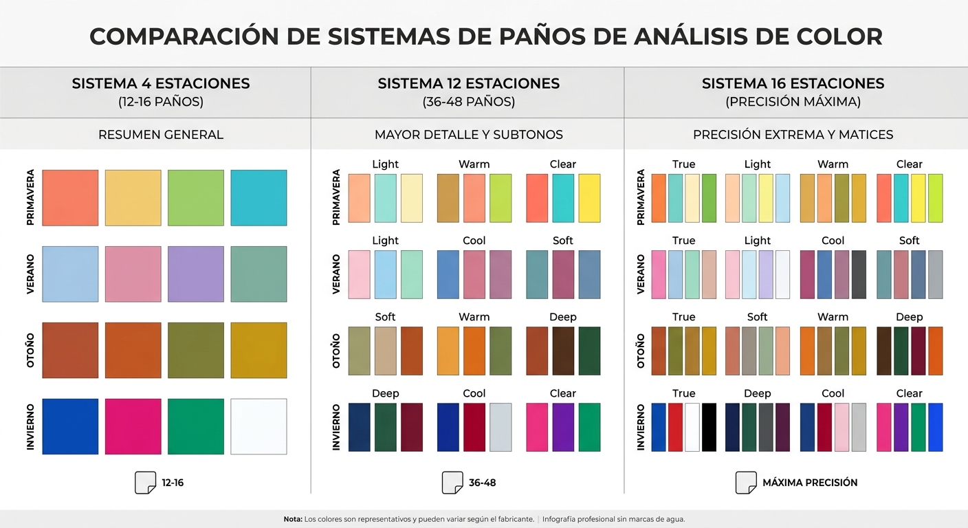
Four-season drapes
The classic starting point. Twelve to sixteen drapes total, organized into spring, summer, autumn, and winter groups. Perfect for new consultants, mobile setups, or anyone who wants a clean, decisive session without overwhelming the client. A four-season kit forces you to make confident calls — which, frankly, most clients prefer over a thirty-minute debate about whether they’re a soft summer or a light summer.
12-season drapes
The US industry standard for full-spectrum analysis. You get the sub-seasons (bright spring, soft autumn, cool winter, and so on), which means more precise palette recommendations and a more sophisticated session. These kits typically run 36 to 48 drapes and require a longer consultation slot — plan on two hours minimum.
16-season drapes
For consultants who’ve built a niche around hyper-personalized color work. The extra sub-seasons let you fine-tune across value and chroma in ways most clients won’t consciously notice — but they’ll feel the difference when their wardrobe finally clicks.
What to look for in fabric quality
- Matte finish. Shine reflects ambient light and skews your read.
- Consistent dye saturation across the set. Hold two drapes side by side. If one looks faded, the whole comparison is compromised.
- Generous size. A drape should cover from collarbone to mid-chest, wide enough to fall over both shoulders.
- Hemmed edges. Frayed fabric looks unprofessional and sheds onto dark clothing.
- True-to-season hues. A “warm autumn rust” should look like rust, not pumpkin or brick.
Lighting: The Tool Everyone Underestimates
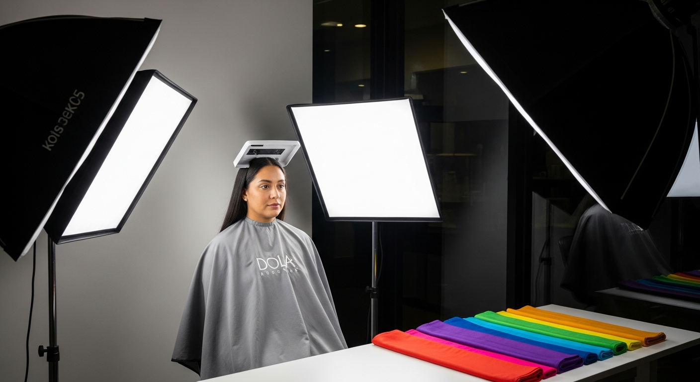
You can own the best drape set in the country and still get the wrong answer if your lighting is off. Skin tone shifts dramatically under different color temperatures, and most homes and studios are lit for ambiance, not analysis.
The gold standard is north-facing natural daylight between 10 a.m. and 2 p.m. Realistically, you need a backup — because clients book at 4 p.m. in November, and the sun doesn’t care about your schedule.
What to buy
- A full-spectrum daylight lamp rated at 5000K to 6500K
- A CRI (Color Rendering Index) of 95 or higher — below that, colors look muddy
- Two light sources minimum, positioned to eliminate shadows under the chin and around the eyes
What to avoid
- Warm “soft white” bulbs (2700K) — they push every client toward autumn
- Single overhead fixtures that cast harsh downward shadows
- Mixing daylight bulbs with incandescent in the same room
If you’re working out of a home studio, swap every bulb in the analysis room to the same daylight temperature. It’s a $40 fix that solves 80% of lighting problems.
Frames: Why Professionals Use Them
Color analysis frames are rigid backings — usually foam board or laminated card — that hold drapes flat around the client’s face. They block out distracting background color (your studio wall, her sweater, the houseplant behind her) and create a controlled visual field.
If you’ve ever tried to analyze a client wearing a bright pink blouse, you know why frames matter. The brain reads everything in the visual field at once. Isolate the face, and the comparison becomes obvious.
When to add frames to your kit
- You’re moving from mobile work to a fixed studio
- Clients are commenting that they “can’t tell the difference” between drapes
- You want cleaner before/after photos for marketing
- You’re charging premium rates and need the setup to match
You can explore professional color analysis frames and drape sets built specifically for consultation work — the rigid backing makes a measurable difference in how confidently clients accept your read.
How Do You Know If Your Color Analysis Kit Is Actually Complete?
Here’s a practical test. Run through a mock session with a friend. If you hit any of these moments, you’ve got a gap:
- You squint to compare two drapes — your lighting is wrong
- You hesitate between two seasons because the fabric looks similar — your drape quality is off
- Your client keeps looking at her own outfit instead of her face — you need a neutral cape
- You can’t show her the difference between “bright” and “soft” — you’re missing sub-season drapes
- She leaves without a written palette — you need take-home materials
A complete kit eliminates all five. Not because you’re a perfectionist, but because each gap costs you confidence in the moment — and your client can feel it.
Reference Materials and Client Takeaways
The session ends, your client goes home, and within 48 hours she’s standing in a department store wondering if that mauve sweater is “her” mauve. Reference materials are how she answers that question without texting you.
What every kit should include
- Printed palette cards with 30-50 colors per season, labeled clearly
- A neutrals guide — most clients struggle more with browns, beiges, and grays than with vibrant colors
- Metals recommendation (silver, gold, rose gold, mixed)
- Makeup direction — lip, blush, and eye color families that align with the season
- A “colors to avoid” page — sometimes more useful than the yes list
Digital deliverables
A growing share of consultants send a PDF summary the same day. It doesn’t replace the printed card — clients love the physical reference — but it gives them something to pull up at the mall. If you want a template to start from, you can also point clients to a basic color analysis and style overview so they understand the framework before their session.
Setting Up Your Physical Space
Your kit lives somewhere. How that space is arranged affects every session you run.
The essentials of a working studio
- A neutral gray or off-white wall behind the client’s chair (not stark white — it bounces too much)
- A mirror large enough for the client to see her full face and shoulders
- A second hand mirror so she can examine drapes up close
- Storage that keeps drapes flat, dust-free, and organized by season
- A small table for palette cards, water, and her phone
If you’re mobile
Plenty of consultants travel to clients. A mobile kit needs a soft-sided case for drapes, a portable daylight lamp (clip-on or battery-powered), a collapsible mirror, and a neutral cape you can throw over whatever the client is wearing. Heavier rigid frames usually stay home — substitute a black or gray fabric cape that serves the same isolating function.
Budget Tiers: What to Buy First
Most new consultants don’t have $2,000 to drop on a complete setup. You don’t need to. Build in stages.
| Stage | Budget | What to Buy | What to Skip (for now) |
|---|---|---|---|
| Starting out | $150-300 | Four-season drape set, daylight bulbs, printed palette cards | Frames, ring light, branded folders |
| Building clientele | $400-700 | Upgrade to 12-season drapes, add neutral cape, dedicated lamp | 16-season set, digital app subscriptions |
| Established studio | $1,000+ | Frames, ring light for content, premium palette books | Nothing — invest in what your business needs |
The most common mistake is buying a 16-season set in month one and never feeling confident enough to use it. Start where you are. Upgrade as your skill and client base grow.
Common Mistakes When Building a Kit
Buying drapes from craft store fabric
It seems thrifty until you realize the dye lots don’t match the season system, the fabric reflects light unpredictably, and clients can tell. Professional drapes are calibrated. Craft fabric is decorative.
Skipping the lighting upgrade
People will spend $400 on drapes and analyze under a $12 lamp from a discount store. The lamp will make the drapes lie. Spend at least $80-150 on real daylight lighting.
Over-buying reference books
You don’t need every color analysis manual published since 1980. Pick one methodology (12-season is the US standard), learn it thoroughly, and stop collecting. Theoretical depth doesn’t make sessions better — practice does.
Forgetting the client experience
A kit is for the consultant, but the session is for the client. A bottle of water, a tissue box, a comfortable chair, and a clean mirror matter as much as your drapes. Image consultants who join AICI often emphasize this — the professional standard isn’t just accurate analysis, it’s the full client experience.
Maintaining and Storing Your Kit
Drapes are textiles. They fade, wrinkle, and pick up oils from hands and makeup. A few habits keep them session-ready for years.
- Store flat or rolled — never folded sharply at the same spot
- Spot-clean with a damp white cloth; avoid detergents that contain optical brighteners
- Keep them out of direct sunlight when not in use
- Inspect before each session for stains, snags, or color shift
- Replace any drape that no longer matches its set — one off-color piece compromises the whole comparison
Most professional drape sets last 5-7 years with regular use. The Four-Season Color Analysis Drape Set is a good example of what a starter investment looks like — enough range to run real sessions, sized for studio or mobile work, and built to hold up to weekly use.
When to Upgrade From a Starter Kit
You’ll know it’s time when:
- You’re booking 4+ sessions a week and your drapes show wear
- Clients are asking specifically about bright vs. soft sub-seasons
- You’re charging $250+ per session and the kit needs to match the price point
- You’re shooting content (Instagram, YouTube, before/afters) and need consistent visuals
- You’ve outgrown mobile work and have a dedicated studio space
None of these are reasons to panic-buy. They’re signals that your business is ready for the next investment.
Building Confidence With Your Tools
Here’s the truth nobody tells new consultants: the kit only does half the work. The other half is your eye — and that takes reps. Run free sessions on friends, family, and willing strangers in your first three months. Photograph every session (with permission). Compare your initial read to your final call. Notice where you hesitated.
The consultants who build real reputations aren’t the ones with the most expensive setups. They’re the ones who used a modest kit so often that draping became second nature. A starter color analysis kit in capable hands beats a luxury kit in hesitant ones every single time.
So if you’re staring at a wishlist that feels overwhelming, simplify. Get the drapes right. Get the lighting right. Get one good mirror and a printed palette guide. Start booking sessions. The rest will tell you what it wants to be — your clients, your style, and your growing confidence will shape the kit far better than any blog post could.
When you’re ready to build your foundation, take a closer look at a professional drape set designed for working consultants. It’s the piece that touches every session you’ll ever run — and the one place a well-chosen color analysis kit pays you back the fastest.