
Picture the colors of a maple forest in late October — not the bright, candy-corn oranges of early fall, but the deeper, smokier reds and the rich olive of leaves about to drop. That’s your closet, if you’re a Deep Autumn. And if you’ve ever felt like the cheerful pastels everyone raves about make you look tired, while a charcoal turtleneck makes strangers ask if you got a great night’s sleep — you’re in the right place.
The deep autumn color palette is one of the most flattering in the entire 12-season system, but it’s also one of the most misunderstood. People assume “autumn” means pumpkin spice and burnt orange head to toe. Deep Autumn is actually closer to a jewel box: dark, warm, saturated, with depth that pulls focus to your eyes and skin instead of fighting them.
What makes someone a Deep Autumn?
Deep Autumn sits at the intersection of two seasonal families — Winter and Autumn — and borrows the best traits of each. From Winter, it takes depth: high contrast, low value, the ability to wear true darks without being swallowed by them. From Autumn, it takes warmth: a golden undertone, an affinity for earth tones, a softness in the eyes that cool colors flatten out.
If your coloring is rich and warm-leaning, with dark hair, dark eyes, and skin that tans easily and rarely burns badly, Deep Autumn might be your home season. Think of the way Lupita Nyong’o glows in espresso brown, or how Eva Mendes lights up in deep teal. That’s the palette working.
Common Deep Autumn features
- Hair: dark brown, black-brown, deep auburn, sometimes with warm highlights in sunlight. Rarely ash or platinum naturally.
- Eyes: dark brown, hazel, deep olive-green, amber, or warm black. Often with golden flecks near the pupil.
- Skin: ranges across the full spectrum — fair with warm undertones, golden olive, tan, deep bronze, rich brown, ebony. The common thread is warmth, not lightness or darkness.
- Overall impression: rich, grounded, warm. Not icy, not pastel, not “soft.”
One useful test: hold a piece of black fabric near your face, then a piece of camel brown. If black looks fine but camel makes your skin look lit from within, you’re probably leaning Autumn. If camel works but a softer dusty rose washes you out, you’re likely on the deeper end.
How do you know if the deep autumn color palette is yours?
There’s no substitute for a proper draping session — laying actual fabric next to your face under neutral light is how professionals confirm a season. But you can get reasonably close at home with a few honest checks.
The three quick checks
- The white test. Put on a pure optic-white t-shirt, then switch to a warm ivory or cream. If white feels harsh and ivory feels like a soft hug, you’re warm. Deep Autumns almost always prefer ivory.
- The metal test. Try silver jewelry, then gold. If gold makes your skin look healthy and silver looks cold against you, that’s warm undertone confirmation. Bronze and copper should also feel “right.”
- The black test. Wear a black turtleneck under good daylight. Does your face look strong and defined, or does it look gray and sunken? Deep seasons can carry black, but Deep Autumns often look even better in dark chocolate brown or deep forest green.
If you want certainty, a análisis de colorimetría y estilo gratuito walks you through the process step by step and removes the guesswork.
The core deep autumn color palette
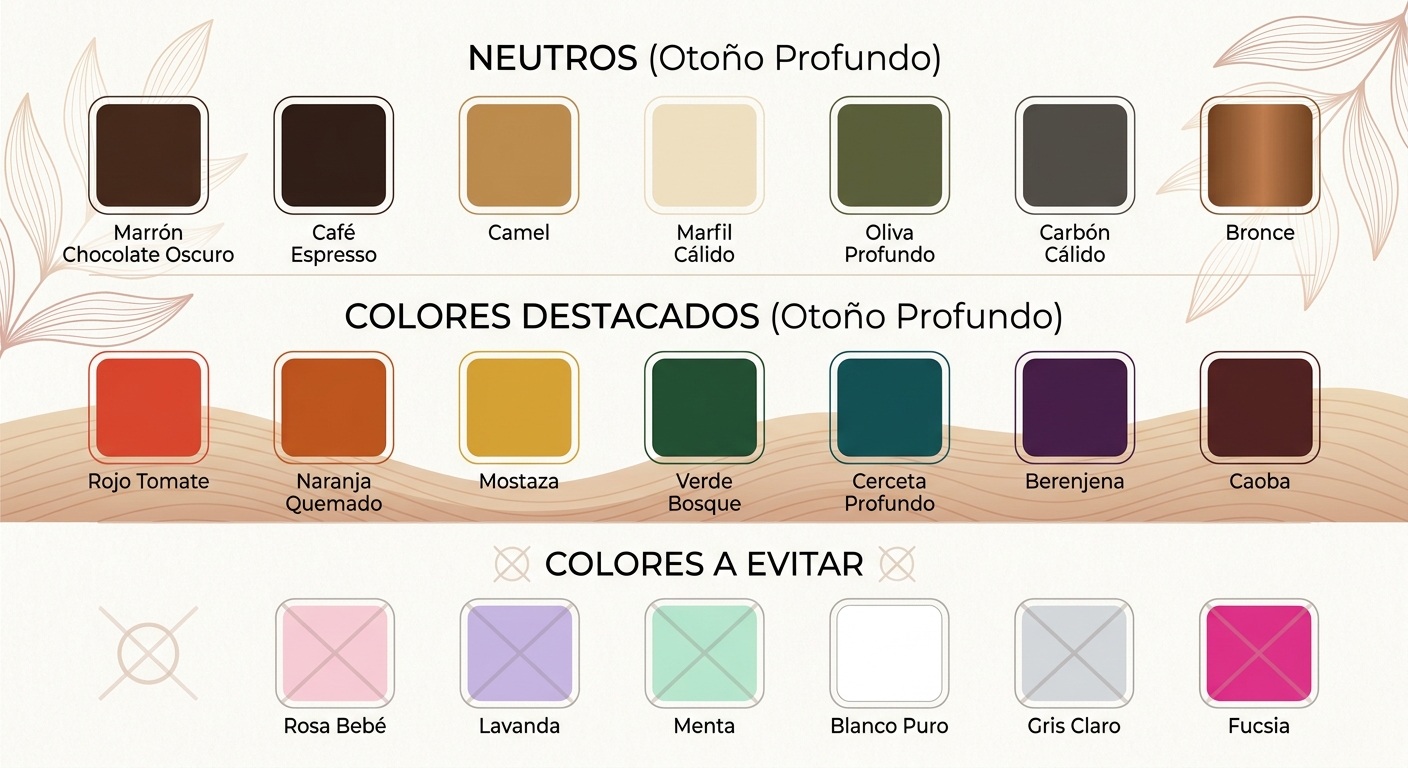
This is where it gets fun. Your palette is built on three principles: warm undertones, low value (dark), and medium-to-high chroma (saturated). No pastels. No icy brights. No dusty grays. Instead, think spices, jewels, forests, and forged metals.
Neutrals — your everyday foundation
- Dark chocolate brown
- Espresso
- Camel and warm caramel
- Warm ivory and cream
- Deep olive
- Warm charcoal (with a brown undertone, not blue)
- Bronze and antique gold
These are your jeans, blazers, coats, and bags. A camel trench, espresso boots, an olive cargo skirt — these will form the bones of a Deep Autumn closet and never look dated.
Statement and accent colors
- Tomato red and deep brick
- Pumpkin and burnt orange (yes, but the smoky version)
- Mustard and goldenrod
- Forest green and pine
- Deep teal and peacock
- Aubergine and warm plum
- Mahogany and cordovan
- Marigold and amber
Think of these as your “I want to be remembered” colors. A peacock blouse under a camel coat. A pumpkin sweater with espresso jeans. Mustard accessories against forest green. They sound bold on paper but feel natural on you because they share the same warm, deep, saturated DNA.
Surprising additions that work
A few colors most people don’t expect on an “autumn” palette:
- Tomato red — warmer and slightly orange-leaning. Spectacular for evening.
- Deep turquoise — has enough warmth to read as teal-adjacent on you.
- Warm raspberry — when you want something pinkish without the cool blue undertone.
- Soft black — works best when broken up by a warm scarf, gold jewelry, or a tomato-red lip.
Colors to approach with caution
This is the part that saves you money. Knowing what not to buy is half the value of color analysis. Deep Autumn struggles with anything icy, pastel, or blue-based, because those colors fight your natural warmth.
The colors that drain you
- Baby pink, baby blue, lavender, mint — all too cool, too light
- Pure white (try ivory instead)
- Fuchsia, magenta, hot pink — too cool and too bright
- Light gray, slate, dove gray — all cool-leaning
- Neon anything
- Pure jet black head-to-toe (it can work in pieces, but rarely as a full outfit)
If you’ve ever bought a pale pink sweater because the model looked great in it, only to feel washed out at home — this is why. The sweater wasn’t wrong. It just wasn’t yours.
Deep Autumn at a glance — comparison table
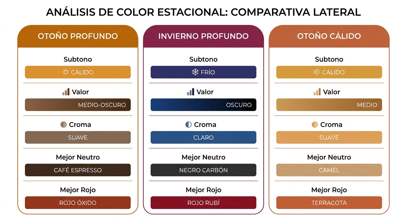
| Attribute | Deep Autumn | Common confusion: Deep Winter | Common confusion: Warm Autumn |
|---|---|---|---|
| Undertone | Warm, golden | Cool, blue-based | Strongly warm |
| Value | Dark | Dark | Medium |
| Chroma | Medium-high (saturated) | High (bright, clear) | Medium (softer) |
| Best neutral | Dark chocolate brown | True black | Camel |
| Best red | Tomato, brick | True red, cherry | Rust, terracotta |
| White option | Warm ivory | Pure optic white | Cream |
| Metals | Antique gold, bronze | Silver, platinum, white gold | Yellow gold, copper |
Notice the pattern. Deep Autumn shares depth with Deep Winter but warmth with Warm Autumn. It’s the bridge between them — which is why mis-typing happens so often.
Building a Deep Autumn wardrobe that actually works
A palette is only as good as the outfits you build from it. Here’s how to translate the swatches into a closet that runs itself.
Start with three anchor neutrals
Pick three from this list and build around them: dark chocolate brown, camel, espresso, deep olive, warm ivory. These should make up roughly 60% of your wardrobe — jeans, trousers, blazers, knits, outerwear. They mix with everything else and don’t compete with statement colors.
Add two or three statement colors per season
Rotate based on what excites you. For fall and winter, try pumpkin, forest green, and aubergine. For spring and summer, lean into tomato red, mustard, and warm teal. Buy these in pieces you’ll actually reach for — a knit, a blouse, a dress — not in trendy silhouettes that’ll feel dated by April.
Accessorize in warm metals and earth tones
Antique gold jewelry, bronze hardware on bags, tortoiseshell sunglasses, warm cognac leather. These small details tie your whole look to your palette and make even a basic outfit feel intentional.
A sample capsule, head to toe
- Tops: warm ivory silk blouse, forest green merino sweater, tomato red knit tee, olive button-down
- Bottoms: dark chocolate wide-leg trousers, espresso jeans, camel midi skirt
- Outerwear: camel wool coat, dark olive utility jacket
- Shoes: cognac ankle boots, bronze flats, espresso loafers
- Bag: warm tan leather tote
- Jewelry: antique gold hoops, a single bronze cuff, tortoise hair clip
That’s roughly fifteen pieces, and every combination works because every piece shares the same temperature and depth.
Makeup for Deep Autumn
Your clothes are only half the picture. Makeup that matches your palette pulls the whole look together. The principle is the same: warm, deep, saturated.
Lips
- Brick red, tomato, terracotta — your everyday flattering
- Warm berry and mahogany for evening
- Nude with a peachy-brown base, never pinky-beige
Eyes
- Bronze, copper, deep olive, espresso, warm plum
- Skip cool gray, icy silver, and frosty pastels
- Liner in dark brown often flatters more than jet black
Cheeks
Warm peach, terracotta, or brick blush — anything with a golden or orange undertone. Cool pinks will look stripey on warm skin.
How professionals confirm a Deep Autumn diagnosis
If you’re a stylist or image consultant reading this, here’s where it gets technical. The fastest way to confirm Deep Autumn against neighboring seasons is comparative draping. You can talk theory all day, but a tomato-red drape next to a magenta drape settles the question in five seconds.
The drapes that matter most
- Warm vs. cool red: tomato (warm) vs. cherry (cool). Deep Autumn glows in tomato; cherry pulls the face down.
- Warm vs. cool dark: dark chocolate vs. true black. Chocolate brightens the eyes; black can flatten warm skin.
- Warm vs. cool white: ivory vs. optic white. Ivory softens; optic white creates harsh shadow.
- Bright vs. muted: a saturated forest green vs. a soft sage. Deep Autumn comes alive in the saturated version.
For studio work, a quality drape set is non-negotiable. The Four-Season Color Analysis Drape Set at $119 covers all four seasonal families and lets you see how a client responds to warm versus cool, bright versus muted, light versus deep — without having to swap kits mid-session. It’s a solid starting point whether you’re building your first professional setup or training your eye at home.
A note on lighting
Draping under warm tungsten light will make everyone look like an Autumn. Draping under cool fluorescent light flattens warmth. Use full-spectrum daylight bulbs (around 5000K) or natural north-facing daylight. Get this wrong and your diagnosis is wrong.
Real-world examples — Deep Autumns in the wild
Sometimes it helps to see the season on people you already recognize. While we can’t always confirm a celebrity’s exact season without draping them ourselves, the following have public coloring that reads strongly Deep Autumn: Lupita Nyong’o, Jennifer Lopez in her warmer phases, Salma Hayek, Eva Mendes, Penélope Cruz, Sofia Vergara, Kerry Washington in her warm-leaning looks. Notice what they wear on red carpets — rich emerald, deep gold, tomato red, warm bronze. Rarely icy pastels.
What they avoid is just as telling. You’ll almost never see them in baby blue, mint, or fuchsia. When stylists put them in those colors, the photos rarely make best-dressed lists.
Common Deep Autumn mistakes
Wearing too much black
Deep Autumn can wear black — but as a supporting player, not the lead. A black blazer over a tomato-red top works. A full black outfit often looks heavier than intended. If you love black, soften it with warm ivory, gold jewelry, or a brown leather bag.
Buying based on trends, not temperature
If sage green is having a moment but you’re a Deep Autumn, the trendy dusty sage will fight your warmth. The deep forest version of the same trend? Yours, all day.
Confusing Deep Autumn with Warm Autumn
Warm Autumn lives in softer, medium-value earth tones — rust, terracotta, sage, oatmeal. Deep Autumn needs more depth and saturation to look balanced. If you find Warm Autumn colors making you look slightly faded, you’re probably the deeper version.
Forgetting that hair color changes everything
If you dye your hair platinum blonde or ash brown, you may need to lean on darker, more saturated clothing and warmer makeup to keep your face from getting lost. Going back to your natural depth is the easiest fix, but not always the one people want — so adjust the wardrobe accordingly.
Seasonal shopping cheat sheet
| Season | Buy more of | Skip |
|---|---|---|
| Spring | Warm ivory, tomato red, olive, marigold | Tagged 12 season color analysis, deep autumn color palette, seasonal color palette, spring color palette