
Ever stand in front of your mirror, holding up two different tops—one a soft pastel, the other a bold black and white stripe—and wonder why one just sings on you while the other falls flat? It’s not just about the color itself; it’s often about how those colors interact with your natural features. That’s where contrast level color analysis comes in. Understanding your personal contrast can unlock a whole new level of style, helping you choose outfits, makeup, and even hair colors that truly harmonize with you.
Think of it like this: your natural features—your hair, skin, and eyes—create a unique color story. Some people have a dramatic difference between their hair and skin, like dark hair against fair skin. Others have a more gentle, blended look. This difference is your contrast, and knowing yours is a game-changer for building a wardrobe that feels effortlessly “you.”
What Exactly is Contrast Level in Color Analysis?
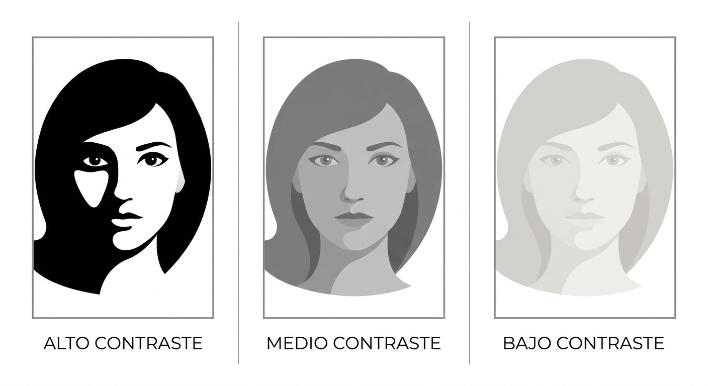
In the world of personal color analysis, “contrast” refers to the degree of difference in value (lightness or darkness) between your key features: your hair, skin, and eyes. It’s not just about what colors you wear, but how those colors are arranged and how much visual “pop” they create when placed next to each other. Your natural contrast level dictates how well you can pull off high-contrast patterns, subtle monochromatic looks, or something in between.
Imagine a black-and-white photograph. High contrast would show stark blacks and bright whites with minimal gray in between. Low contrast would feature many shades of gray, with no true black or white. Your personal coloring works similarly. By identifying your natural contrast, you can replicate that level of visual interest in your outfits, creating a look that feels balanced and authentic.
Why Does Your Contrast Level Matter for Your Style?
Understanding your contrast level is a powerful tool because it helps you:
- Choose prints and patterns: High contrast individuals can rock bold, graphic prints, while low contrast types often shine in more blended, subtle patterns.
- Select outfit combinations: Knowing your contrast guides you in pairing colors. Should you go for a deep navy with a crisp white, or a soft gray with a muted blue?
- Pick flattering makeup: From eyeshadow to lipstick, your contrast level influences how intense or subtle your makeup should be.
- Decide on hair color: A hair color that’s too far off your natural contrast can look artificial or wash you out.
- Create harmony: When your clothing and accessories echo your natural contrast, you create an overall harmonious and polished appearance.
How Do You Determine Your Personal Contrast Level?
Determining your contrast level is a visual exercise that involves looking closely at your hair, skin, and eye colors. It’s about finding the range between the lightest and darkest points in your natural features. Here’s a simple way to assess it:
- Hair Color: Note the natural depth of your hair. Is it very dark (black, deep brown), medium (medium brown, dark blonde), or very light (light blonde, white)?
- Skin Tone: Observe the overall lightness or darkness of your skin. Is it fair, light, medium, or deep?
- Eye Color: Look at your eyes. Are they very dark (dark brown, black), medium (hazel, blue, green), or very light (light blue, light green, light gray)?
Once you’ve noted these, you’re looking for the difference between your darkest feature and your lightest feature. Let’s break down the three main categories: high, medium, and low contrast.
High Contrast: Striking & Dynamic
High contrast individuals have a significant difference between their hair, skin, and/or eye colors. The most classic example is dark hair, fair skin, and bright eyes. Think of someone with dark brown hair, porcelain skin, and vivid blue eyes. There’s a clear, defined separation between these elements.
Characteristics of High Contrast:
- Hair: Often very dark (black, deep brown) or very light (platinum blonde, striking white).
- Skin: Can be very fair or very deep, creating a strong visual break with the hair.
- Eyes: Often bright and clear, standing out against the skin or hair.
Style Tips for High Contrast:
- Outfit Combinations: You can effortlessly wear strong, clear color pairings. Think black and white, navy and bright red, or emerald green and cream. These bold combinations will mirror your natural intensity.
- Patterns: Geometric prints, bold stripes, polka dots, and large, defined patterns look fantastic on you.
- Makeup: You can handle more dramatic eye makeup (like a winged liner) or a bold lip without being overwhelmed.
- Jewelry: Statement pieces and high-shine metals often complement your striking look.
Example: Imagine a person with deep black hair, fair olive skin, and piercing green eyes. Their natural contrast is high. If they wear a soft, monochromatic outfit in all beige, it might wash them out. But put them in a crisp white shirt with a black blazer, and they look incredibly vibrant and chic.
Medium Contrast: Balanced & Versatile
Medium contrast individuals have a noticeable but not extreme difference between their features. There’s a good balance, but not the stark separation of high contrast. This is a very common contrast level, offering a lot of versatility.
Characteristics of Medium Contrast:
- Hair: Often medium brown, auburn, or dark blonde.
- Skin: Light to medium, or medium to deep, with a moderate difference from the hair color.
- Eyes: Can be any color, but they don’t necessarily “pop” in a dramatic way against the hair and skin.
Style Tips for Medium Contrast:
- Outfit Combinations: You look great in medium-value color pairings. Think jewel tones with neutrals, or a mix of light and medium shades. A deep teal sweater with a camel skirt, or a charcoal gray suit with a light blue shirt.
- Patterns: Medium-sized prints, subtle florals, checks, or plaids often work well. Avoid overly tiny or extremely large, graphic patterns.
- Makeup: You can go for a moderately smoky eye or a berry lip. You have flexibility to play with intensity.
- Layering: This is your superpower! Layering different shades of the same color, or mixing complementary colors, creates visual interest without being too stark.
Example: Consider someone with medium brown hair, warm medium skin, and hazel eyes. Their features blend harmoniously but still have definition. A monochromatic outfit in all black might feel a bit heavy, but a black top with a deep olive skirt and gold accessories would look fantastic.
Low Contrast: Soft & Blended
Low contrast individuals have features that blend together harmon harmoniously, with minimal difference in value. There’s a soft, gentle quality to their overall appearance. Think of someone with light blonde hair, fair skin, and light blue eyes, or deep brown hair with deep brown skin and dark brown eyes.
Characteristics of Low Contrast:
- Hair: Often light blonde, light to medium brown, or gray/white that blends softly with the skin. Or, very deep hair that blends with deep skin.
- Skin: Fair, light, or deep, with a soft, gentle transition from the hair.
- Eyes: Often light (light blue, light green, light gray) or very dark (deep brown) that blend with the hair and skin.
Style Tips for Low Contrast:
- Outfit Combinations: You shine in monochromatic looks or tone-on-tone pairings. Think different shades of cream, soft grays, or various hues of blue. Aim for subtle shifts in value rather than stark contrasts.
- Patterns: Small, delicate prints, tone-on-tone textures, subtle ombrés, or soft watercolor effects are perfect. Avoid anything too bold or graphic.
- Makeup: A natural, “no-makeup makeup” look is your best friend. Soft eyeshadows, a touch of mascara, and a tinted lip balm will enhance your features without overpowering them.
- Texture: Because you don’t rely on strong color contrast, texture becomes a key player. Think cashmere, silk, linen, or subtle knits to add interest.
Example: Imagine a person with ash blonde hair, fair, cool-toned skin, and soft gray-blue eyes. Their features are all in a similar value range. A stark black and white outfit would likely feel too harsh and distracting. But a light gray sweater over an ivory blouse with silver jewelry would create a beautifully cohesive and elegant look.
The Role of Seasons and Contrast Level Color Analysis
Your contrast level is closely linked to your color season, but it’s an additional layer of detail that refines your palette. While your season (like Bright Spring or Deep Winter) gives you a range of colors, your contrast level tells you how to combine those colors.
Let’s look at how contrast often aligns with the 12-season system:
- High Contrast Seasons: Bright Winter, Deep Winter, Bright Spring, Deep Autumn. These seasons naturally have a high contrast in their ideal palettes, featuring clear, saturated colors paired with strong neutrals.
- Medium Contrast Seasons: Warm Spring, Cool Summer, Warm Autumn, Cool Winter. These seasons often benefit from a balanced approach, mixing medium-value colors with slightly lighter or darker neutrals.
- Low Contrast Seasons: Light Spring, Light Summer, Soft Summer, Soft Autumn. These seasons thrive in blended, muted, or light-on-light (or dark-on-dark) combinations. Their palettes are inherently harmonious and gentle.
Understanding this connection helps you not only pick the right colors but also arrange them in a way that truly complements your natural coloring. For instance, a Deep Winter (high contrast) will look amazing in black and fuchsia, while a Soft Autumn (low contrast) might prefer a muted olive green with a soft terracotta.
| Contrast Level | Hair/Skin/Eye Relationship | Ideal Outfit Strategy | Example Seasons |
|---|---|---|---|
| High Contrast | Significant difference (e.g., dark hair, fair skin) | Bold, clear color pairings; strong patterns | Bright Winter, Deep Winter, Bright Spring, Deep Autumn |
| Medium Contrast | Noticeable but balanced difference | Medium-value color mixes; moderate patterns | Warm Spring, Cool Summer, Warm Autumn, Cool Winter |
| Low Contrast | Features blend softly (e.g., light hair, light skin) | Monochromatic, tone-on-tone; subtle patterns | Light Spring, Light Summer, Soft Summer, Soft Autumn |
Practical Tools for Assessing Contrast in a Color Analysis Session
For personal stylists and image consultants, accurately assessing a client’s contrast level is a crucial step in a comprehensive color analysis session. While a keen eye is essential, professional tools can make the process more precise and help clients visualize their contrast.
One of the most effective tools for this is a dedicated Contrast Pack — Color Analysis Drapes. These specialized fabric drapes are designed to help you determine whether a client’s natural features call for high, medium, or low contrast in their styling. By holding different contrast levels of drapes against the client, you can observe how their features respond.
Using Contrast Drapes in Your Consultation
During a draping session, after you’ve likely identified the client’s undertone and overall season, you can introduce the contrast drapes. Here’s how they help:
- High Contrast Drapes: These often feature stark black and white, or other very distinct light and dark combinations. When held against a client, you’ll immediately see if their features “hold up” to this intensity or if they become overwhelmed.
- Medium Contrast Drapes: These might include fabric combinations with a noticeable but not extreme difference in value, like a medium gray with a lighter or darker shade. They help identify those who thrive in balanced, versatile looks.
- Low Contrast Drapes: These will show very little difference in value, perhaps various shades of cream, beige, or soft grays. For low contrast clients, these drapes will look harmonious and natural, making their features shine rather than fading into the background.
Observing the client’s skin, eyes, and hair as you drape these fabrics provides clear visual cues. Do their eyes sparkle with the high contrast? Does their skin look clearer with the low contrast? These are the questions the drapes help answer.
For professionals, incorporating a dedicated contrast assessment elevates the quality of your personal color analysis. It moves beyond just finding the “right” colors to showing clients how to combine those colors in a way that truly reflects their inherent beauty.
Beyond the Basics: Nuances of Contrast
While high, medium, and low are the primary categories, contrast can have additional layers:
- Value Contrast: This is the most common type we’ve discussed – the lightness/darkness difference.
- Chroma Contrast: This refers to the difference in brightness or saturation. Someone with very bright eyes and muted hair might have a chroma contrast to consider.
- Temperature Contrast: Less common, but sometimes one feature leans warm while another leans cool (e.g., warm skin, cool eyes). This can create a unique contrast that might require a more neutral or balanced approach.
Most of the time, when we talk about contrast in color analysis, we’re focusing on value contrast, as it’s the most impactful for outfit combinations and overall visual harmony. For a deeper dive into the overall methodology of personal color analysis, you might find the Wikipedia article on Personal Color Analysis a useful resource.
Putting Your Contrast Level into Practice
Now that you have a better idea of your contrast level, how do you use this information every day?
1. Building a Cohesive Wardrobe
- High Contrast: Don’t shy away from pairing bold colors or wearing strong patterns. Your wardrobe can feature crisp whites, deep blacks, and vibrant accent colors.
- Medium Contrast: Focus on building outfits with 2-3 distinct but harmonious colors. Think layering and mixing different textures in similar value ranges.
- Low Contrast: Embrace monochromatic or analogous color schemes. Your closet might be full of beautiful neutrals and soft, blended colors.
2. Makeup Choices
- High Contrast: You can pull off a bold red lip or a strong eyeliner without it looking too much.
- Medium Contrast: Experiment with a smoky eye or a berry lipstick. You have room to play with a bit more intensity.
- Low Contrast: Stick to natural, soft makeup looks. Focus on enhancing your features subtly rather than adding strong color.
3. Hair Color Decisions
When considering a new hair color, try to stay within your natural contrast range. If you’re low contrast, going from a light blonde to a stark black might feel too dramatic and artificial. If you’re high contrast, a subtle, blended balayage might not give you the punch you naturally carry.
4. Accessorizing
Your accessories should also echo your contrast. High contrast individuals can wear bold statement jewelry, while low contrast types might prefer delicate pieces or accessories that blend softly with their outfit.
Final Thoughts on Your Contrast Level Color Analysis Journey
Understanding your personal contrast level is like finding another piece of your unique style puzzle. It’s not about strict rules, but about gaining insight into what makes you look and feel your best. When your outfits mirror your natural coloring, there’s an undeniable sense of ease and confidence that comes through.
Whether you’re a high-contrast dynamo, a versatile medium-contrast maven, or a soft, low-contrast beauty, embracing this aspect of your personal color analysis will empower your style choices. Keep experimenting, keep observing, and enjoy the journey of discovering your most harmonious self. For those looking to dive deeper into all aspects of their personal coloring, exploring a comprehensive análisis de colorimetría y estilo gratuito can provide even more tailored insights.