
Ever feel like you’re doing everything “right” with your style, but something still feels… off? You’ve got a closet full of clothes, but nothing quite makes you light up. Or maybe you’ve had a color analysis session, and you’re staring at your results, a little overwhelmed by all the new terms and color swatches. Learning how to read color analysis results is like getting the secret decoder ring for your personal style. It’s not just about knowing your season; it’s about understanding why those colors work for you, and how to use that knowledge every single day.
Think of your color analysis results as your personal style blueprint. It’s a guide tailored precisely to your unique natural coloring – your skin, eyes, and hair. Once you grasp the fundamentals, you’ll stop guessing and start choosing clothes, makeup, and even hair colors that make you look radiant, refreshed, and completely authentic. No more buying things that just sit in your closet, or feeling like certain outfits wear you instead of the other way around. Let’s break down what those results really mean and how to confidently apply them.
Understanding the Core Elements of Your Color Analysis
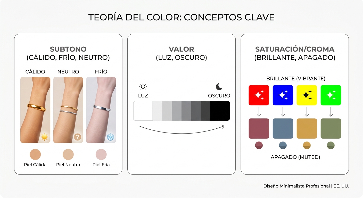
Before we dive into the specific seasons, it’s crucial to understand the three main characteristics that define your personal color palette: undertone, value, and chroma. These are the building blocks that color consultants use during a draping session, often with professional 4 Seasons Color Analysis Drapes, to pinpoint your best colors. Getting familiar with these terms will help you interpret your results with much greater clarity.
What is Your Undertone: Warm, Cool, or Neutral?
Your undertone is the most fundamental aspect of your color analysis. It’s the subtle hue beneath the surface of your skin that never changes, regardless of sun exposure or redness. Identifying your undertone is often the first step in any personal color analysis (PCA).
- Cool Undertone: If you have a cool undertone, your skin has hints of pink, red, or blue. You likely look fantastic in silver jewelry, and pure white or true black clothing makes your skin glow. Think icy blues, emerald greens, and deep purples.
- Warm Undertone: A warm undertone means your skin has golden, peach, or yellow hues. Gold jewelry probably looks amazing on you, and off-white or cream colors are more flattering than stark white. Your palette will lean towards olive greens, rich browns, and vibrant oranges.
- Neutral Undertone: Lucky you! A neutral undertone means you have a balance of both warm and cool tones, or neither is dominant. This often means you can wear a wider range of colors, and both gold and silver jewelry look good on you.
During a color analysis session, a consultant uses various drapes to see how different temperatures react with your skin. For example, a cool-toned drape might make a warm-toned person look sallow or washed out, while a warm-toned drape might bring out redness in a cool-toned person. This immediate visual feedback is key to determining your true undertone.
Value: Light or Dark?
Value refers to how light or dark your overall natural coloring is. This includes your skin tone, eye color, and natural hair color. Are you naturally fair with light blonde hair and blue eyes, or do you have deep brown skin, dark hair, and rich brown eyes? Your value impacts the depth of color that harmonizes best with you.
- Light Value: If you have light skin, hair, and eyes, lighter, softer colors will typically be your best friends. Think pastels, muted tones, and colors that aren’t too overwhelming.
- Deep Value: For those with darker skin, hair, and eyes, rich, saturated, and darker colors will often look stunning. Deep jewel tones and intense shades can handle your natural depth without overpowering you.
It’s important to remember that value isn’t about race or ethnicity, but about the inherent lightness or darkness of your features. Someone with light skin can have deep-value features if their hair and eyes are very dark, and vice-versa.
Chroma: Bright or Muted?
Chroma, sometimes called intensity or saturation, describes how clear or soft your colors are. Do you look best in bold, vibrant hues, or do more subdued, dusty tones make you shine?
- Bright Chroma: If you have bright chroma, you can handle clear, vivid, and highly saturated colors. Think of colors that pop – clear reds, electric blues, and vibrant fuchsias. These colors won’t wear you; they’ll complement your natural brightness.
- Muted Chroma (or Soft Chroma): For those with muted chroma, softer, more subdued, or “dusty” colors are typically more flattering. These colors have a touch of gray in them, making them less intense. Think olive greens, dusty roses, and soft teals. Highly saturated colors might feel too harsh or overwhelming on you.
Your chroma is often tied to the clarity of your eyes and the contrast in your features. Someone with very clear, sparkling eyes often has a bright chroma, while someone with softer, blended features might have a muted chroma.
Decoding Your Seasonal Color Palette
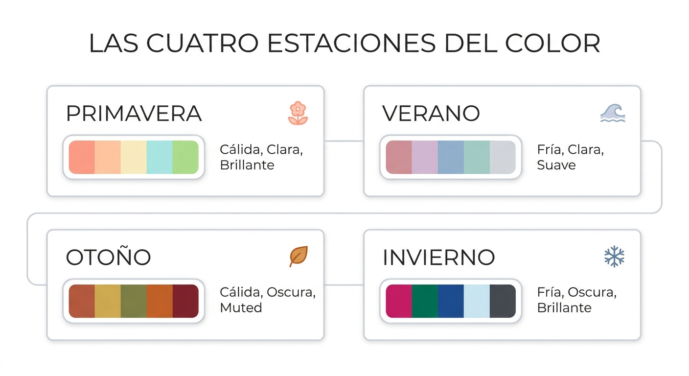
Most professional color analysis systems, including the 12-season system widely used in the US, categorize individuals into one of the four main seasons (Spring, Summer, Autumn, Winter), each further divided into three sub-seasons. Once you know your undertone, value, and chroma, identifying your season becomes much clearer. This is where personal color analysis truly brings your unique palette to life.
The Spring Seasons: Warm, Light, and Bright
Spring types are characterized by warmth, lightness, and often a clear, bright quality. Think of the fresh, vibrant colors of springtime flowers and new growth.
- Bright Spring: These individuals have a clear, warm, and bright appearance. They can handle vibrant, energetic colors like clear coral, bright turquoise, and fresh lime green. Their primary characteristic is brightness, followed by warmth.
- Warm Spring: The warmest of the Spring types, Warm Springs glow in rich, golden-toned colors. Think golden yellow, warm peach, and true spring green. Their primary characteristic is warmth, followed by brightness and lightness.
- Light Spring: Light Springs have a delicate, airy quality. Their best colors are soft, light, and warm, like pastel peach, light aqua, and soft butter yellow. Their primary characteristic is lightness, followed by warmth and a touch of brightness.
If you’re a Spring, your overall impression is lively and fresh. Your colors should reflect that vibrancy without being too dark or heavy.
The Summer Seasons: Cool, Soft, and Light
Summer types are cool, soft, and often have a delicate, muted quality. Imagine a hazy summer day, full of muted blues and greens.
- Light Summer: Light Summers have a gentle, delicate appearance. Their best colors are light, cool, and somewhat soft, like powder blue, soft rose, and lavender. Their primary characteristic is lightness, followed by coolness.
- Cool Summer: The coolest of the Summer types, Cool Summers shine in true cool tones. Think dusty blue, cool pink, and charcoal gray. Their primary characteristic is coolness, followed by softness.
- Soft Summer: Soft Summers have a blended, muted quality. Their ideal colors are soft, cool, and somewhat desaturated, like dusty teal, muted plum, and soft sage green. Their primary characteristic is softness, followed by coolness.
For Summer types, the key is avoiding anything too harsh, bright, or warm. Soft, smoky, and cool colors will enhance your natural elegance.
The Autumn Seasons: Warm, Deep, and Soft (or Muted)
Autumn types are characterized by warmth, depth, and a rich, earthy quality. Think of the colors of falling leaves and a cozy autumn landscape.
- Soft Autumn: Soft Autumns have a gentle, blended appearance. Their best colors are soft, warm, and muted, like olive green, dusty peach, and warm taupe. Their primary characteristic is softness, followed by warmth.
- Warm Autumn: The warmest of the Autumn types, Warm Autumns radiate in rich, earthy, and truly warm colors. Think pumpkin orange, rust, and deep moss green. Their primary characteristic is warmth, followed by depth and softness.
- Deep Autumn: Deep Autumns have a strong, rich appearance. Their ideal colors are deep, warm, and saturated, like dark chocolate brown, deep teal, and rich burgundy. Their primary characteristic is depth, followed by warmth.
If you’re an Autumn, your colors should have a natural, grounded feel. Avoid anything too icy, bright, or pastel that might wash out your natural richness.
The Winter Seasons: Cool, Deep, and Bright
Winter types are cool, deep, and often have a clear, striking quality. Imagine the crisp, clear colors of a winter landscape.
- Deep Winter: Deep Winters have a strong, dramatic appearance. Their best colors are deep, cool, and clear, like true black, deep navy, and forest green. Their primary characteristic is depth, followed by coolness.
- Cool Winter: The coolest of the Winter types, Cool Winters look stunning in icy, clear, and truly cool tones. Think true red, royal blue, and fuchsia. Their primary characteristic is coolness, followed by brightness.
- Bright Winter: Bright Winters have a vibrant, clear appearance. Their ideal colors are clear, cool, and highly saturated, like electric blue, bright magenta, and vivid emerald green. Their primary characteristic is brightness, followed by coolness.
For Winter types, clarity and intensity are key. Your colors should be bold and crisp, reflecting your natural high contrast.
Putting Your Results into Practice: Beyond the Draping Session
Receiving your color analysis results is just the beginning. The real magic happens when you start applying that knowledge to your everyday life. This isn’t about throwing out your entire wardrobe; it’s about smart, informed choices that elevate your style.
Building Your Wardrobe with Your Palette
Once you know your season, you can start curating a wardrobe that truly makes you shine. Here’s how:
- Identify Your Core Neutrals: Every season has its best neutrals. For example, a Cool Summer might gravitate towards charcoal gray and soft navy, while a Warm Autumn would look amazing in rich browns and olive green. Use these as the foundation for your wardrobe.
- Incorporate Your Best Accent Colors: These are the vibrant, exciting colors that bring your palette to life. A Bright Winter might use electric blue, while a Light Spring could opt for a cheerful coral.
- Shop Smart: When you’re out shopping, keep your color analysis drapes or a small swatch book of your season’s colors handy. Hold items up to your face in natural light. Does the color make your skin look healthy and vibrant, or does it cast shadows and make you look tired?
- Consider Fabric and Texture: While color is primary, fabric and texture also play a role. A Deep Winter might look incredible in a sleek, structured fabric in a deep jewel tone, while a Soft Summer might prefer a flowy, textured fabric in a muted shade.
Remember, color analysis isn’t about rules; it’s about guidelines. If you love a color outside your palette, try wearing it away from your face – perhaps in a skirt, pants, or shoes. Or, pair it with one of your best colors to soften its impact.
Makeup and Hair Color: Your Face Framers
Your color analysis results are incredibly powerful when it comes to makeup and hair color, as these are right next to your face and have a huge impact.
Choosing the Right Makeup
Your makeup should harmonize with your natural coloring, enhancing your features without overpowering them. Here’s a quick guide:
| Season | Best Lip Colors | Best Eyeshadows | Best Blush Tones |
|---|---|---|---|
| Spring | Coral, peach, warm pink, clear red | Warm browns, bronze, light greens, peach | Peach, warm pink, apricot |
| Summer | Rose, berry, cool pink, soft plum | Cool grays, soft blues, taupe, lavender | Soft rose, cool pink, mauve |
| Autumn | Terracotta, rust, deep coral, brick red | Olive green, deep brown, bronze, warm plum | Terra cotta, deep peach, warm berry |
| Winter | True red, fuchsia, berry, deep plum | Charcoal, true black, icy blue, emerald green | Cool pink, cherry red, deep berry |
Foundation and concealer should always match your undertone. If you’re a cool season, look for foundations with pink or blue bases. If you’re warm, opt for yellow or golden bases. Neutral tones can often blend well with either.
Finding Your Perfect Hair Color
Your hair color is one of the most visible elements of your personal style. Choosing a hair color within your seasonal palette can make a dramatic difference, making your skin look clearer and your eyes brighter.
- Spring: Think golden blondes, strawberry blondes, warm light to medium browns. Avoid ash tones or very dark colors.
- Summer: Cool, ash blondes, soft browns, and cool light to medium browns. Avoid golden or reddish tones.
- Autumn: Rich, warm coppers, golden browns, auburns, and deep mahogany. Avoid icy blondes or stark black.
- Winter: Deep, cool browns, true black, platinum blonde (if natural contrast is high), and rich, cool reds. Avoid golden or overly warm tones.
If you’re considering a new hair color, consult with your stylist and bring your color analysis results. They can help you find a shade that truly enhances your natural beauty.
Advanced Tips for Using Your Color Analysis Results
Once you’ve mastered the basics of your season, you can start to play with your palette in more sophisticated ways. This is where your inner image consultant comes alive!
How Can You Incorporate Your Sister Seasons?
The 12-season system is built on a spectrum. You might lean slightly into a “sister season” that shares one of your dominant characteristics. For example:
- A Bright Spring might borrow some bright, clear colors from a Bright Winter.
- A Soft Summer could find some harmonious muted tones in a Soft Autumn palette.
- A Deep Autumn might comfortably wear some deep, rich colors from a Deep Winter.
This doesn’t mean you can wear every color from a sister season, but it opens up possibilities for expanding your wardrobe and finding more variety. Focus on the shared characteristic – brightness, softness, warmth, coolness, lightness, or depth.
Understanding Contrast and Prints
Your personal contrast level (the difference between your skin, hair, and eye colors) also plays a role in how you wear prints and color combinations. During a professional color analysis, your consultant will often note this.
- High Contrast: If you have a high contrast (e.g., dark hair, light skin, bright eyes like a Deep Winter), you can wear bold prints with strong color differences. High contrast color blocking will also look fantastic.
- Medium Contrast: Most people fall into this category. You can wear a good range of prints, but might look best with patterns that have a clear but not overly stark difference in colors.
- Low Contrast: If your features are gently blended (e.g., light hair, light skin, light eyes like a Light Summer), you’ll look best in prints with subtle color differences and gentle blends. Monochromatic or analogous color schemes will be very flattering.
Applying your contrast level to your fashion choices ensures your clothes complement your natural features, rather than overwhelming or washing them out.
Accessorizing with Confidence
Accessories are fantastic for incorporating your best colors, especially if you have a lot of neutrals in your wardrobe or want to experiment. Scarves, jewelry, handbags, and shoes can all be used to bring your seasonal colors closer to your face or add a pop of your best hues.
- Jewelry: As discussed, your undertone often dictates whether gold or silver looks best. Warm seasons generally shine in gold, cool seasons in silver, and neutral seasons can wear both.
- Scarves: A scarf in one of your absolute best colors, wrapped near your face, can instantly brighten your complexion, even if the rest of your outfit is a neutral.
- Handbags & Shoes: These are great for adding a splash of your accent colors without committing to a full garment.
Don’t underestimate the power of accessories to tie an outfit together and enhance your natural coloring. They’re often an affordable way to infuse your best colors into your existing wardrobe.
The Ongoing Journey of Personal Style
Learning how to read color analysis results is a powerful step in your personal style journey. It’s not just about getting a label; it’s about gaining a deeper understanding of what makes you look and feel your best. This knowledge empowers you to make intentional choices, whether you’re shopping for new clothes, picking out makeup, or deciding on a new hair color. Your color palette is a tool to help you express your authentic self with confidence and radiance.
Embrace your unique colors and let them guide you to a wardrobe that truly reflects your inner glow. If you’re an image consultant or personal stylist, remember that professional tools like high-quality color analysis drapes are essential for providing these transformative insights to your clients. For personal use, or to deepen your understanding, exploring different seasonal palettes with fabric samples can be incredibly enlightening. Happy styling!