
Ever walked into a store, picked out a gorgeous blouse, and then tried it on only to feel… off? Like the color was wearing you instead of the other way around? Or maybe you’ve got friends who swear by warm tones, while others look incredible in cool blues, and you just feel lost in the middle. If that sounds familiar, you might just have a neutral undertone.
For many, figuring out their personal color palette feels like trying to solve a puzzle with missing pieces. We hear a lot about “warm” and “cool” undertones, but what about those of us who don’t clearly fit into either box? Having a neutral undertone means you have a balanced mix of both warm and cool pigments in your skin. It’s a beautiful, versatile place to be, but it can also make choosing colors feel a little trickier since you don’t have those strong, obvious cues.
This article is all about demystifying the neutral undertone. We’ll explore what it truly means for your personal style, how to identify it, and most importantly, how to pick colors that make you look vibrant, healthy, and completely yourself. Get ready to unlock a whole new world of color confidence!
What Does “Neutral Undertone” Really Mean?
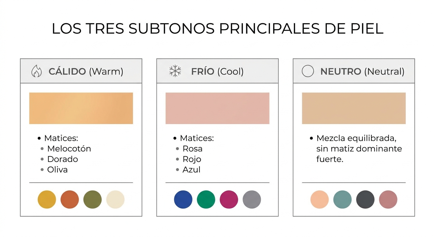
Let’s start with the basics. Your skin’s surface color (your overtone) can change with sun exposure or even redness, but your undertone is the subtle hue beneath the surface that remains constant. It’s the intrinsic color that affects how clothes, makeup, and even hair colors look against your skin. Most people fall into one of three categories: warm, cool, or neutral.
People with warm undertones often have a peachy, golden, or olive hue, sometimes described as having yellow or green undertones. They typically look fantastic in earthy tones, rich reds, oranges, and warm greens. Think of the glow you get from a sunset.
Cool undertones, on the other hand, tend to have pink, red, or blue hues. These individuals sparkle in jewel tones like emerald green, sapphire blue, deep purples, and true reds. Imagine the crispness of a winter morning.
A neutral undertone is exactly what it sounds like: a balance between warm and cool. Your skin doesn’t lean strongly one way or the other. This means you might have a mix of pink and yellow tones, or perhaps no strong dominant hue at all. This balance gives you incredible flexibility, allowing you to borrow from both warm and cool palettes, provided you choose the right intensity and value.
It’s important to remember that undertone isn’t about skin deepness. You can have fair skin, medium skin, or deep skin and still have a neutral undertone. It’s about the underlying pigment, not how light or dark your complexion is.
The Science Behind Skin Undertones
Without getting too academic, skin undertones are largely determined by the amount and type of melanin and hemoglobin in your skin. Melanin, the pigment responsible for skin, hair, and eye color, comes in two main forms: eumelanin (brown/black) and pheomelanin (red/yellow). The balance of these, along with the red pigment from hemoglobin in your blood vessels, contributes to your overall undertone.
For those with a neutral undertone, there’s a harmonious blend, meaning neither the warmer pheomelanin nor the cooler blue/red tones from deeper blood vessels strongly dominates. This creates a versatile canvas that can adapt to a wider range of colors.
How Do You Know if You Have a Neutral Undertone?
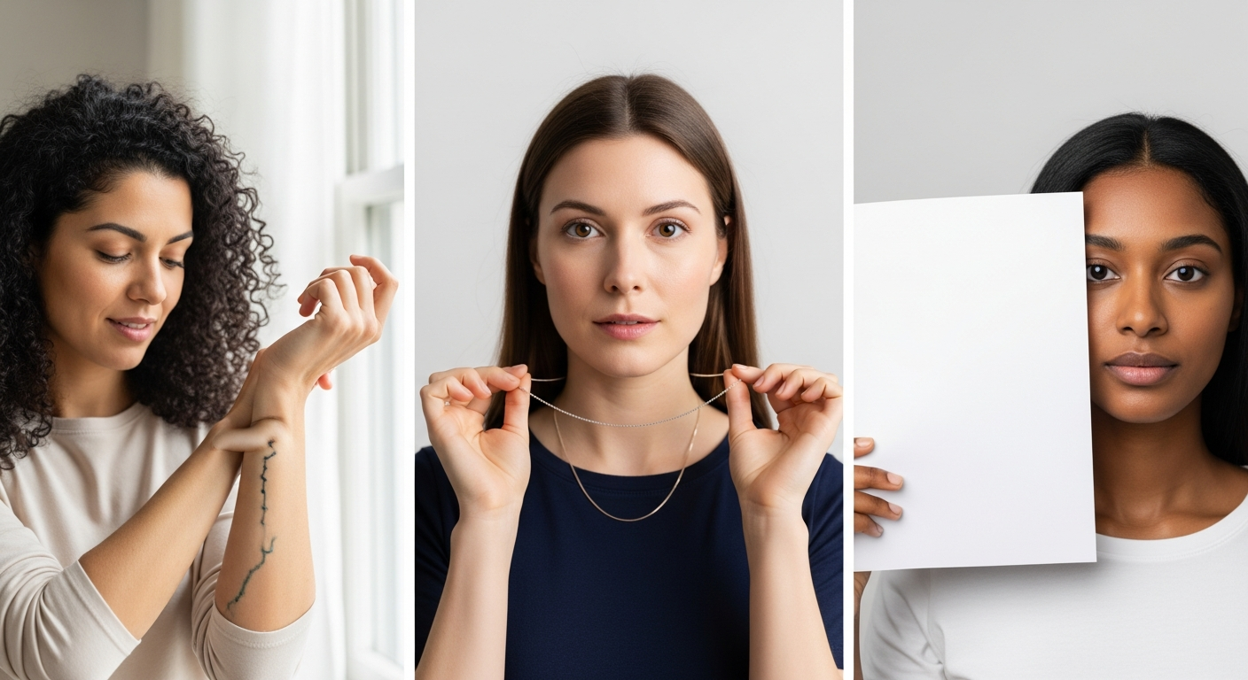
Identifying your undertone can feel a bit like detective work, but it’s a fun process that empowers your style choices. Here are a few reliable tests to help you figure out if you have a neutral undertone:
1. The Vein Test
- Look at the veins on the inside of your wrist in natural light.
- If your veins appear predominantly blue, you likely have cool undertones.
- If they look mostly green, you probably have warm undertones.
- If you see a mix of both blue and green, or if they’re hard to distinguish and seem more teal or purplish-blue, you very likely have a neutral undertone.
2. The Jewelry Test
This is a classic for a reason! Hold different types of jewelry up to your skin (without wearing it, just hold it next to your face or wrist) and see what looks best.
- If silver jewelry makes your skin look radiant and healthy, you lean cool.
- If gold jewelry makes you glow, you lean warm.
- If both silver and gold jewelry look equally good on you, enhancing your complexion without making you look washed out or sallow, you’ve probably got a neutral undertone. You might even find that rose gold looks particularly stunning on you!
3. The White Paper Test
In natural light, hold a plain white sheet of paper next to your bare face (no makeup!).
- If your skin looks pink, rosy, or bluish against the white, you’re cool.
- If your skin appears yellowish, peachy, or golden, you’re warm.
- If your skin seems to have a balanced mix, or appears grayish or olive, you’re likely neutral. This test is great for revealing subtle nuances.
4. The Sun Reaction Test
How does your skin react to sun exposure?
- If you burn easily and rarely tan, you likely have cool undertones.
- If you tan easily and rarely burn, you likely have warm undertones.
- If you sometimes burn and sometimes tan, or if your tan develops to a golden brown without much redness, this could point to a neutral undertone.
5. The Fabric Drape Test
This is the most accurate test, and it’s what professional image consultants use. Draping involves holding different colored fabrics (color analysis drapes) up to your face in natural light to see how they impact your complexion. For a neutral undertone, you’ll find that certain warm colors and certain cool colors both look good, but often with a preference for balanced or “true” versions of those colors.
A professional drape set, like the 4 Seasons Drapes — Color Analysis, which retails for $149, is designed to help pinpoint these nuances by categorizing colors into four main seasonal palettes. While a full professional consultation goes deeper, even a basic análisis de colorimetría y estilo gratuito can start you on the right path.
Remember, no single test is definitive on its own. It’s about looking for consistent patterns across multiple tests. If you’re still unsure, consider visiting a professional color consultant. They use specialized tools and trained eyes to give you a precise analysis.
Dressing a Neutral Undertone: Your Versatile Palette
Having a neutral undertone means you have a superpower: versatility! You’re not strictly limited to warm or cool colors, which opens up a huge array of options. The key is to find colors that are also neutral in their temperature, or that lean slightly warm or cool without being overpowering.
Instead of focusing solely on warm vs. cool, think about these dimensions for your best colors:
- Value: How light or dark a color is.
- Chroma: How bright or muted a color is (also called intensity).
- Temperature: How warm or cool a color is.
For neutral undertones, especially those who aren’t strongly leaning one way, often the best colors are those that are also balanced in their temperature. This includes true reds, true blues, and greens that aren’t too yellow or too blue. Muted or soft versions of colors often work well, as they don’t have an extreme temperature bias.
Core Neutral Colors for Your Wardrobe
These are your safe bets, your go-to shades that will always look fantastic:
- True White: Not too creamy, not too stark. A clean, crisp white.
- Charcoal Gray: A sophisticated alternative to black, softer and often more flattering than harsh black for many neutral undertones.
- Taupe: That perfect blend of gray and brown. Utterly chic.
- Soft Beige: Avoid anything too yellow or too pink.
- Navy Blue: A classic that works for almost everyone, but especially for neutrals.
- Mid-Tone Browns: Not too reddish, not too ashy.
Colors to Embrace
This is where the fun begins! You can pull from both sides of the spectrum. The trick is often finding the “true” version of a color, or one that has a balanced temperature.
- Blues: Your sweet spot is often true blue, royal blue, denim blue, and certain teals that have both blue and green elements. Avoid overly icy blues or very warm, greenish-blues.
- Greens: Emerald green, forest green, jade, and even some olive greens that aren’t too yellow. Avoid highly acidic or neon greens.
- Reds: True red, ruby red, cranberry. These reds have a balance of blue and yellow pigments. Avoid reds that are too orange or too fuchsia.
- Purples: Medium purples like amethyst, lavender, and plum often look stunning. Avoid very deep, cool purples or extremely warm, reddish purples.
- Pinks: Rose pink, dusty rose, and medium fuchsia (not too blue).
- Yellows: Lemon yellow (if it’s not too bright), buttercup yellow, or a soft, muted mustard. Very bright, primary yellows can sometimes be too much.
Here’s a quick overview of how neutral undertones can navigate color categories:
| Color Category | Best for Neutral Undertones | Colors to Approach with Caution |
|---|---|---|
| Neutrals | True White, Charcoal Gray, Taupe, Soft Beige, Navy Blue, Mid-Tone Browns | Stark Black (can be too harsh), Creamy Yellow-Beige |
| Blues | Royal Blue, True Blue, Denim, Teal, Cerulean | Icy Blues, Very Greenish-Blues |
| Greens | Emerald, Forest Green, Jade, Medium Olive | Acid Green, Neon Green, Very Yellow-Greens |
| Reds | True Red, Ruby Red, Cranberry | Orange-Red, Berry Red (if too blue) |
| Purples | Amethyst, Lavender, Plum, Medium Violet | Very Deep Cool Purples, Extremely Warm Reddish-Purples |
| Pinks | Rose Pink, Dusty Rose, Medium Fuchsia | Bubblegum Pink, Very Pale Peachy Pink |
| Yellows | Soft Lemon, Buttercup, Muted Mustard | Bright Primary Yellow, Goldenrod |
What About the “Seasons” for Neutral Undertones?
In the 12-season color analysis system, neutral undertones often fall into the “soft” or “true” categories within each season. For example:
- Soft Summer / Soft Autumn: These seasons are predominantly neutral-cool and neutral-warm, respectively, and are characterized by muted chroma. If your neutral undertone also has a soft quality, these palettes will be fantastic for you.
- True Summer / True Winter / True Spring / True Autumn: While these are often considered “cool” or “warm,” the “true” variations are often the most balanced in temperature within their respective categories, making them accessible to certain neutral undertones. For instance, a “True Summer” might have a distinctly cool undertone, but the colors are not as icy as “Cool Summer.”
- Light Spring / Light Summer: If your neutral undertone is also light in value, these palettes might offer your best colors.
- Deep Autumn / Deep Winter: If your neutral undertone is also deep in value, these palettes could be a great fit.
A professional color analysis session using specific color analysis drapes and consultation frames can pinpoint your exact season and give you a tailored palette, even if you have a neutral undertone. This is where tools like fabric drapes really shine, allowing a stylist to see how different color families interact with your unique complexion.
Makeup and Hair for Neutral Undertones
Your neutral undertone doesn’t just influence your wardrobe; it’s also key to finding your most flattering makeup and hair colors. The goal is always to enhance, not to overpower or clash.
Makeup Tips
- Foundation & Concealer: This is crucial. Look for foundations labeled “neutral,” or those that don’t lean too pink (cool) or too yellow (warm). Many brands now offer a wide range of neutral-toned foundations. Test shades on your jawline in natural light to ensure a seamless blend.
- Blush: Opt for rose, soft peach, or muted berry tones. Avoid anything too orange or too bright fuchsia. A peachy-pink is often a winner.
- Eyeshadows: You have a wide range! Earthy browns, taupes, soft grays, plums, and even some muted greens and blues can look stunning. The key is balance. A neutral undertone can rock a smoky eye with gray or brown, or a pop of color with a balanced teal.
- Lipstick: Your perfect reds are true reds, cranberry, and soft berry shades. For nudes, look for those with a hint of rose or taupe, avoiding anything too yellow-brown or too stark pink. Medium rose, dusty rose, or even a soft coral can be beautiful.
Hair Color Advice
Hair color can be tricky, as it significantly impacts your overall appearance. For a neutral undertone, you want a hair color that complements your skin without making it look sallow or ruddy.
- Blondes: Avoid extremely ash-blondes (can look dull) or overly golden/brassy blondes (can look unnatural). Opt for balanced shades like sandy blonde, neutral blonde, or even a soft strawberry blonde if it’s not too warm.
- Brunettes: Medium browns, chocolate browns, and even some mushroom browns work beautifully. Avoid very reddish browns or extremely cool, almost black-browns unless your natural hair color is already very deep.
- Redheads: If you’re going for red, think balanced coppers, auburns, or rich mahogany. Steer clear of fiery orange-reds or very blue-red purples.
- Black: True black can be very harsh for many neutral undertones. A soft black or a deep, neutral brown is often more flattering.
When in doubt, aim for hair colors that have a balanced, natural look, rather than those with very strong warm or cool tones. Bringing photos of colors you like and dislike to your stylist can be incredibly helpful.
Beyond the Colors: Texture and Contrast for Neutral Undertones
Color is just one piece of the puzzle. How you wear those colors, and the textures and patterns you choose, can also make a big difference for your neutral undertone.
Playing with Contrast
People with neutral undertones often look best with medium levels of contrast in their outfits. This means pairing colors that aren’t too far apart in value (lightness/darkness) but still provide interest.
- Low Contrast: If your neutral undertone is also muted (like a Soft Summer or Soft Autumn), you’ll shine in outfits where colors blend harmoniously rather than sharply contrasting. Think monochromatic looks in different shades of taupe and soft gray, or tone-on-tone outfits.
- Medium Contrast: Most neutral undertones can handle a good medium contrast. This could be pairing a charcoal gray top with a true blue skirt, or a navy blazer over a soft rose blouse. It provides definition without being jarring.
- High Contrast: While you can experiment, very high contrast (like stark black and white) can sometimes be too intense and overpower a neutral undertone, making you look tired or washed out. If you love high contrast, try swapping black for navy or charcoal, and white for a soft off-white.
Embracing Texture
Texture adds depth and interest without relying solely on color. For neutral undertones, incorporating different textures can elevate your look, especially when working with your core neutral colors.
- Think a chunky knit sweater with smooth silk pants.
- A tweed blazer over a soft cotton tee.
- Leather, suede, linen, cashmere – all these add visual richness.
Patterns and Prints
When choosing patterns, consider the colors within the print. Do they align with your best neutral shades? Look for patterns that have a balanced mix of warm and cool elements, or those where the overall impression isn’t overwhelmingly one temperature. For instance, a floral print with rose, soft green, and navy will likely be more flattering than one with bright orange and electric blue.
Real-Life Examples of Neutral Undertones in Style
It’s always helpful to see how this plays out in the real world. While we can’t definitively “diagnose” celebrities, here are some public figures often cited as having neutral undertones, and how they embody it:
- Oprah Winfrey: Often looks incredible in jewel tones, rich purples, and balanced blues, but also carries warmer tones beautifully. Her skin has a harmonious depth that allows for versatility.
- Angelina Jolie: Famous for her ability to wear both cool (like black and white) and warmer tones (such as olive green) with ease. Her complexion often appears to have a balanced quality.
- Kerry Washington: She often shines in a wide spectrum of colors, from vibrant pinks and blues to softer earth tones, suggesting a versatile neutral base.
- Blake Lively: While often associated with warmer, golden blonde hair, she also looks stunning in cooler blues and grays, indicating a neutral-leaning undertone that can pull off a range of temperatures.
These examples highlight that having a neutral undertone isn’t about being bland; it’s about having a wider spectrum of colors to play with, allowing for incredible stylistic range.
Why Understanding Your Undertone Matters
Knowing you have a neutral undertone isn’t just about picking out clothes. It’s a foundational piece of personal style that impacts everything from your makeup to your hair color, and even the accessories you choose. When you wear colors that harmonize with your undertone, you:
- Look Healthier: Your skin appears more radiant, even-toned, and vibrant.
- Appear Younger: The right colors can minimize the appearance of fine lines and dark circles.
- Feel More Confident: When you know you look good, you carry yourself differently.
- Save Money: No more buying clothes that sit in your closet because they just don’t feel “right.”
- Simplify Shopping: You’ll walk into a store with a clearer idea of what colors to gravitate towards, making decisions quicker and more effective.
It’s a powerful tool for unlocking your true potential and elevating your wardrobe to new heights. If you’re an image consultant or personal stylist, understanding how to identify and advise clients with a neutral undertone is a crucial skill. Tools like professional color analysis frames and an extensive drape set are indispensable for providing accurate and empowering consultations.
So, if you’ve done the tests and suspect you have a neutral undertone, celebrate your versatility! You have a unique advantage in the world of color. Take these insights and start experimenting. You might be surprised at how many colors you can truly make your own.