📦 Printed & shipped worldwide 


📦 Printed & shipped worldwide
📦 Printed & shipped worldwide
📦 Printed & shipped worldwide
"This kit gave me the confidence to start offering color analysis services immediately. My clients love seeing the instant transformation, and I've booked 15 new sessions this month alone!"
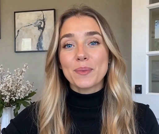
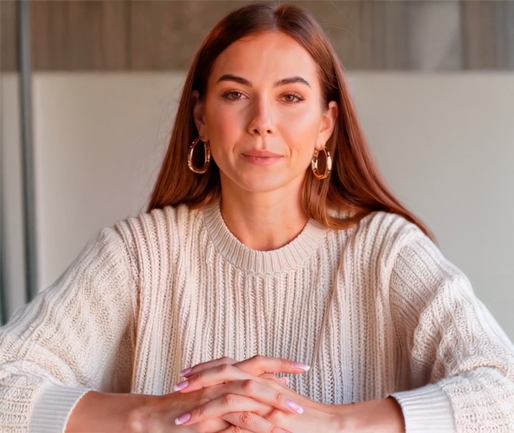
"I spent more than $400+ on fabric drapes that were impossible to travel with. This kit delivers the same accurate results at a fraction of the cost and fits in my laptop bag!"
"The metallic frames are pure genius! They reveal undertones so clearly that even my most skeptical clients are amazed. This kit has elevated my entire practice."
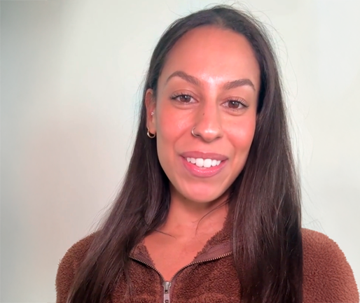
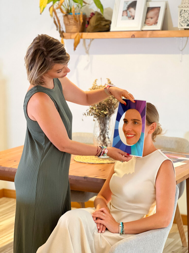
“Finding my clients’ perfect colors is unbelievably easy—just flip through the frames and immediately see which tones pop. It’s simplified my whole process and impressed every single client!”
"Perfect for mobile consultations! I visit clients at their homes and this kit makes me look incredibly professional. The results are consistently accurate every time."
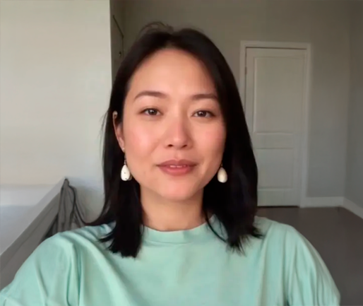
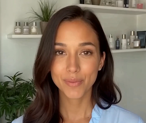
"As a makeup artist, determining foundation undertones used to be guesswork. Now I can nail it instantly! My booking rate has increased 40% since I started using this kit."
"The before/after reveals with these frames sell themselves! Clients immediately understand their seasonal colors and book complete makeover packages on the spot."
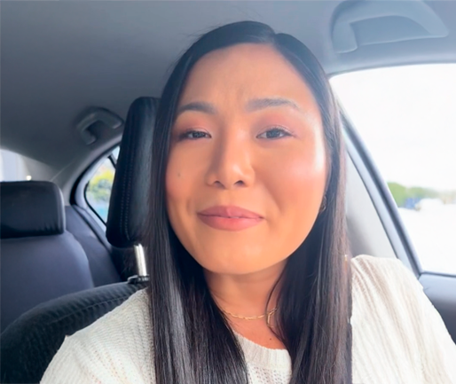
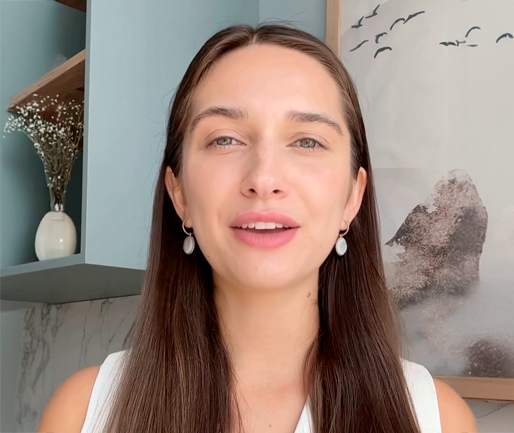
“I used to waste so much time layering physical swatches, but with this kit I can demonstrate color harmony in seconds. My clients are thrilled, and I’ve seen a 50% increase in repeat bookings!”

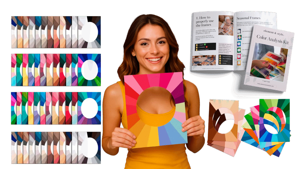
The complete professional color analysis system in 35 strategic frames. Includes base diagnosis, 12 seasonal...
$69.97
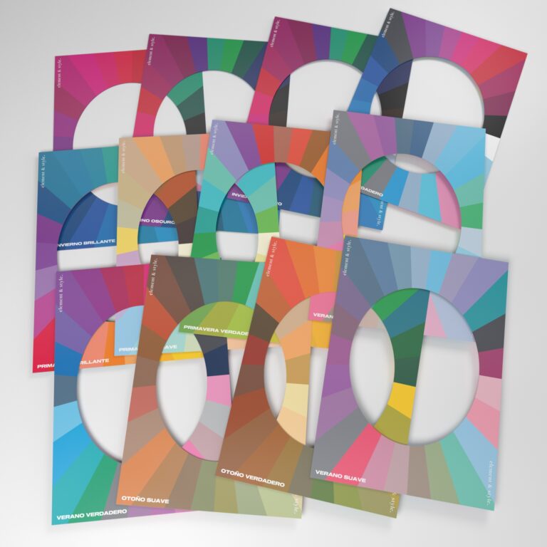
The complete professional Color Analysis Frames Kit with all 108 frames - delivered to your door! Includes...
$149.97
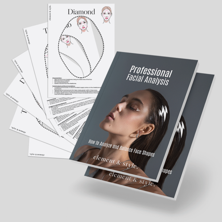
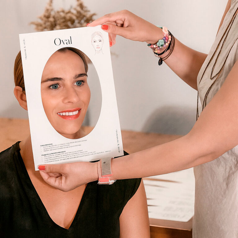
📊 Master professional facial analysis with our complete guide (60+ pages) + 7 specialized templates to identify every face shape....
$29.97
$14.99
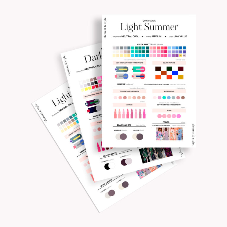
Transform your color analysis with Professional 12-Season Color Templates! 🎨 Includes visual guides, color combos, and personalized tips to en...
$19.97
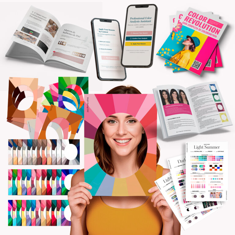
🎨 Master color analysis with the Complete Professional Color Analysis Bundle! Includes 108 color frames, a full training guide, and seasonal pale...
$89.97
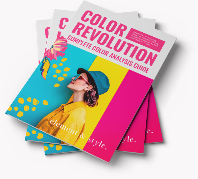
Master color consulting with the Complete Color Analysis Guide! 🖌️ Includes 70 pages of step-by-step methodology, frame interpretation...
$39.97
✨ Transform your style with the Color Analysis Kit! Includes customizable templates and a step-by-step guide to help you discover the colors...
$29.97