
Ever notice how some colors just make you glow? You put on a certain shade, and suddenly your eyes sparkle, your skin looks radiant, and you feel like a million bucks. Then there are those other colors, the ones that make you look a little tired, a little sallow, or just… off. That’s the magic of personal color analysis at play, and if you’ve been told you’re a Warm Spring, get ready to discover your golden ticket to looking and feeling your best.
The warm spring color palette is all about sunshine, vibrancy, and a fresh, lively energy. Think of the first tender greens of spring, the golden hour light, or a field of daffodils. These colors are inherently warm, light, and clear, reflecting a joyful and optimistic spirit. If these words resonate with you, and you’ve got that unmistakable warm glow, you’re in for a treat as we dive into the colors that truly make you shine.
What Makes a Warm Spring Glow? Understanding Your Undertone and Characteristics
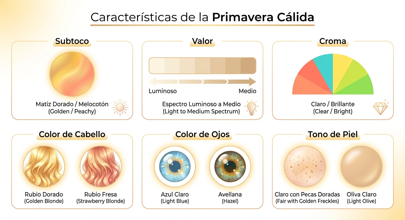
Being a Warm Spring isn’t just about liking certain colors; it’s about how those colors harmonize with your natural characteristics. Your undertone is inherently warm, meaning you have a golden or peachy warmth beneath the surface of your skin. This isn’t about your surface skin color – people of all ethnicities can be Warm Springs – but rather the underlying hue.
What are the Key Characteristics of a Warm Spring?
- Undertone: Definitely warm. You’ll likely have golden, peachy, or yellow-gold undertones. Veins on your wrist might appear more green than blue.
- Value: Light to medium. Warm Springs generally have a lighter overall appearance, though not necessarily pale. Their colors aren’t deep or heavy.
- Chroma: Clear and bright. Your best colors are vibrant, not muted or dusty. You can handle a good amount of saturation without being overwhelmed.
- Hair Color: Often has a golden or reddish tint. Think golden blonde, strawberry blonde, light to medium golden brown, or even a warm auburn.
- Eye Color: Typically light and clear, often with a golden fleck. Common eye colors include light blue, green, hazel, light brown, or amber.
- Skin Tone: Ranges widely but always has a warm undertone. This could be fair with golden freckles, ivory, peach, light olive, or even a warm caramel. You might tan easily to a golden brown.
If you’ve ever found that true white or stark black washes you out, but cream or ivory makes you look radiant, that’s a classic Warm Spring sign. Similarly, silver jewelry might look less harmonious on you than gold. These subtle clues point towards your innate warmth and guide you to your ideal color palette.
Is Warm Spring the Same as True Spring?
This is a common question! In the 12-season color analysis system, “Warm Spring” is often used interchangeably with “True Spring.” Both terms describe the purest form of the Spring season, where warmth is the dominant characteristic, followed by lightness and clarity. It’s not leaning heavily towards Summer (like Light Spring) or Winter (like Bright Spring); it sits right in the heart of the Spring family, radiating pure warmth.
Think of it this way: if Spring is a beautiful garden, Warm Spring is the sunniest, most vibrant part of it, full of golden daffodils, bright green leaves, and clear blue skies. The colors are undiluted and joyful.
The Warm Spring Color Palette: Your Golden Hues
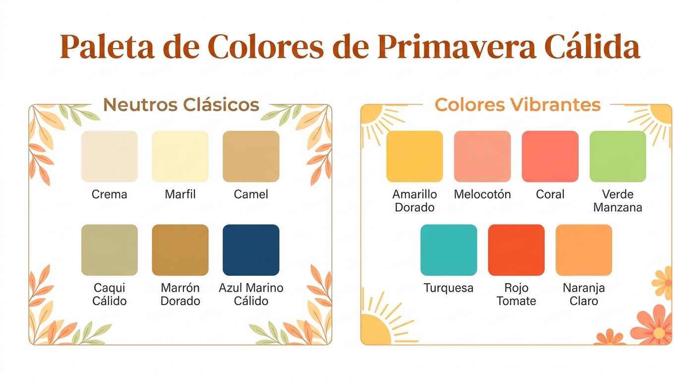
Now for the fun part: exploring the specific colors that make up the Warm Spring palette! These are colors that mirror your natural warmth, clarity, and lightness, making you look harmonious and alive.
Your Core Neutrals: The Foundation of Your Wardrobe
Neutrals are the workhorses of any wardrobe, and for Warm Springs, they should echo your inherent warmth. Forget stark black or icy white.
- Cream & Ivory: These are your absolute best whites. They’re soft, inviting, and won’t drain your color like pure white can.
- Camel & Tan: Rich, warm browns that are perfect for jackets, trousers, and skirts. Think of a camel coat or a beautifully tanned leather bag.
- Warm Khaki & Olive: Earthy greens that blend beautifully with your palette. These are fantastic alternatives to traditional neutrals.
- Golden Brown: A slightly richer, deeper brown with a noticeable golden undertone.
- Navy (Warm Version): A softer, warmer navy that might have a slight teal or green tint, rather than a cool, inky navy.
Imagine building an outfit with a cream blouse, camel trousers, and a touch of golden jewelry. It’s elegant, sophisticated, and perfectly harmonious for a Warm Spring.
Your Vibrant Colors: Adding Life and Energy
This is where the Warm Spring palette truly shines! Your vibrant colors are clear, cheerful, and full of life.
- Golden Yellows: From daffodil to sunflower, any clear, warm yellow is a winner. Avoid lemony or cool yellows.
- Peach & Coral: These are signature Warm Spring colors. Think juicy peaches, coral reefs, and warm salmon. They bring out the glow in your skin.
- Warm Greens: Apple green, lime green, grass green, and clear teal. These are vibrant, fresh greens, not muted forest greens or icy mints.
- Warm Blues: Turquoise, aqua, periwinkle, and a clear, bright sky blue. These blues have a hint of green or yellow, making them warm.
- Warm Reds: Tomato red, poppy red, and clear orange-reds. These are energetic and friendly, not deep burgundy or cool berry shades.
- Light Orange: A soft, clear orange, like a fresh tangerine.
When choosing these colors, always remember the three guiding principles: warm, light, and clear. If a color feels too heavy, too muted, or too cool, it’s probably not for you.
Colors to Approach with Caution (or Avoid Altogether)
Just as some colors make you glow, others can dim your light. For Warm Springs, these usually fall into the cool, dark, or overly muted categories.
- Black: Can be too harsh and draining. If you must wear it, try it away from your face or pair it with a bright Warm Spring accent color.
- Pure White: Too stark. Opt for cream or ivory instead.
- Cool Blues: Icy blues, royal blue, or true navy without a hint of warmth can make you look pale.
- Cool Pinks & Purples: Magenta, fuchsia, lavender, or true purples will clash with your warm undertone. Stick to peachy pinks or warm periwinkle.
- Deep, Muted Colors: Dusty rose, olive green (without warmth), burgundy, or charcoal gray can make you look tired.
- Icy Pastels: Pale blues or pinks with a cool, frosty undertone will lack the vibrancy you need.
The goal isn’t to ban these colors entirely, but to understand why they might not be your best bet and how to adapt. For instance, if you love black, try a black skirt with a vibrant peach blouse, or choose a black with a subtle warm undertone if you can find it.
Building Your Warm Spring Wardrobe: Practical Tips
Knowing your colors is one thing; putting it into practice is another. Here’s how to start curating a wardrobe that celebrates your Warm Spring palette.
1. Start with Your Neutrals
Invest in good quality basics in your core neutrals: cream, ivory, camel, and warm khaki. These form the backbone of your wardrobe and will mix and match effortlessly with your vibrant accent colors.
2. Embrace Your Signature Brights
Identify 2-3 of your favorite vibrant Warm Spring colors – perhaps a golden yellow, a clear coral, and a bright aqua. These can be your go-to shades for blouses, sweaters, and accessories that sit close to your face.
3. Accessorize Strategically
Accessories are a fantastic way to introduce your best colors without a full wardrobe overhaul. Think scarves in a vibrant teal, jewelry in warm gold, or handbags in peach or camel. Sunglasses with warm-toned frames (like tortoise shell or a warm brown) will also enhance your look.
4. Makeup Matters
Your makeup should also reflect your Warm Spring palette. Look for:
- Foundation/Concealer: With a warm, golden, or peachy undertone.
- Blush: Peach, coral, or warm apricot shades.
- Lipstick: Coral, peach, warm pinks, or true red (with an orange undertone).
- Eyeshadow: Warm browns, golds, peach, olive green, or warm teal.
- Eyeliner/Mascara: Brown, warm gray, or even a warm green instead of harsh black.
The right makeup colors can truly make your eyes pop and your skin glow, tying your entire look together.
5. Hair Color: Keep it Warm
If you color your hair, ensure any dyes have warm undertones. Golden blondes, strawberry blondes, light coppers, and warm golden browns will be most flattering. Avoid ash tones, cool browns, or platinum blondes, which can make you look washed out.
6. Don’t Forget Prints and Patterns
When choosing prints, look for patterns that feature a combination of your Warm Spring colors. Floral prints with golden yellows, peach, and apple greens are ideal. Stripes or geometric patterns incorporating your best blues and creams will also look fantastic. The key is that the overall impression of the print should be warm, light, and clear.
Beyond the Closet: Warm Spring in Your Environment
Understanding your color palette isn’t just for your clothes; it can extend to your home decor, personal branding, and even the colors you choose for your digital spaces. Imagine a Warm Spring’s office: perhaps soft cream walls, golden yellow accents, and plants with vibrant green leaves. It feels inviting, energetic, and harmonious, just like your personal style.
When selecting artwork or decorative items for your home, consider pieces that echo the warmth and clarity of your palette. This creates a cohesive and uplifting environment that truly reflects your best self.
Why Professional Color Analysis is a Game-Changer
While you can certainly start experimenting with the Warm Spring color palette on your own, a professional personal color analysis (PCA) takes the guesswork out of it. An experienced image consultant uses specialized tools, like color analysis drapes, to accurately determine your season.
During a draping session, a consultant will place different fabric drapes around your shoulders, observing how each color interacts with your skin, eyes, and hair. They look for how colors enhance your natural features, making your skin appear smoother, your eyes brighter, and reducing the appearance of shadows or imperfections. This isn’t just about what looks “nice”; it’s about what brings you to life.
For image consultants and personal stylists, having a comprehensive drape set is essential. Our Four-Season Color Analysis Drape Set, priced at $119, covers all four main seasons and is a fantastic tool to go beyond just the palette and see the colors against your client’s unique skin. It’s a foundational kit for any professional looking to offer precise and impactful color consultations.
A professional consultation often includes a personalized color swatch book or guide, making it easy to shop with confidence. No more guessing in the dressing room!
Common Questions About the Warm Spring Color Palette
Can Warm Springs wear black?
Generally, black is too harsh for Warm Springs. It can drain your color and make you look tired. If you love black, try wearing it away from your face (e.g., a black skirt or trousers with a vibrant Warm Spring top) or choosing a softer alternative like warm brown, camel, or a deep, warm navy.
What jewelry metals are best for Warm Springs?
Warm Springs look best in gold, rose gold, and copper. These metals harmonize beautifully with your warm undertone. Silver can look too cool and might not be as flattering.
Do Warm Springs have freckles?
Many Warm Springs do have freckles, and they often have a golden or reddish-brown hue that complements their warm complexion. Embrace those sun-kissed spots!
Can a Warm Spring have dark hair?
While many Warm Springs have lighter hair, it’s possible to have medium to even darker golden brown or warm auburn hair. The key is the warmth; it will never be an ashy or cool dark brown.
How can I tell if I’m a Warm Spring vs. a Warm Autumn?
This is where the distinction between seasons becomes important. Both Warm Springs and Warm Autumns have warm undertones. However, Warm Springs are lighter and brighter, while Warm Autumns are deeper and more muted. Think of a Warm Spring as a sunny, clear day, and a Warm Autumn as a rich, earthy harvest scene. If you wear deep, rich colors well, you might lean Autumn. If bright, clear, light colors make you sparkle, you’re likely a Warm Spring.
Embracing Your Warm Spring Radiance
Understanding your warm spring color palette is more than just a fashion trend; it’s a tool for self-discovery and empowerment. When you wear colors that truly harmonize with your natural coloring, you don’t just look good – you feel good. You project confidence, vitality, and authenticity. It simplifies your wardrobe, makes shopping a joy, and ensures that every time you get dressed, you’re putting your best self forward.
So go ahead, fill your closet with those golden yellows, peachy corals, and vibrant aquas. Let your natural radiance shine through, and enjoy the compliments that are sure to come your way. Ready to explore even more about your personal style and color? Take our free color and style analysis to continue your journey!