
Ever stand in front of a mirror, holding up a new top, and something just feels… off? The color looks fantastic on the hanger, but on you? It might make you look tired, washed out, or even a little sallow. Then you try another color, and suddenly, your eyes sparkle, your skin glows, and you look vibrant and alive. What’s the magic trick?
Often, it’s not just the color itself, but how you’re seeing it. The secret ingredient that can make or break a color analysis session, or even your daily outfit choice, is color analysis lighting. Good lighting is like the best friend who always tells you the truth, making sure you see colors exactly as they are. Bad lighting? That’s the unreliable friend who changes their story every five minutes, leaving you confused and frustrated.
For anyone serious about understanding their best colors, or for professional image consultants guiding clients, mastering lighting is non-negotiable. It’s the foundation upon which accurate color decisions are built, and without it, even the most expertly chosen color analysis drapes might lead you astray.
Why Does Lighting Matter So Much for Color Analysis?
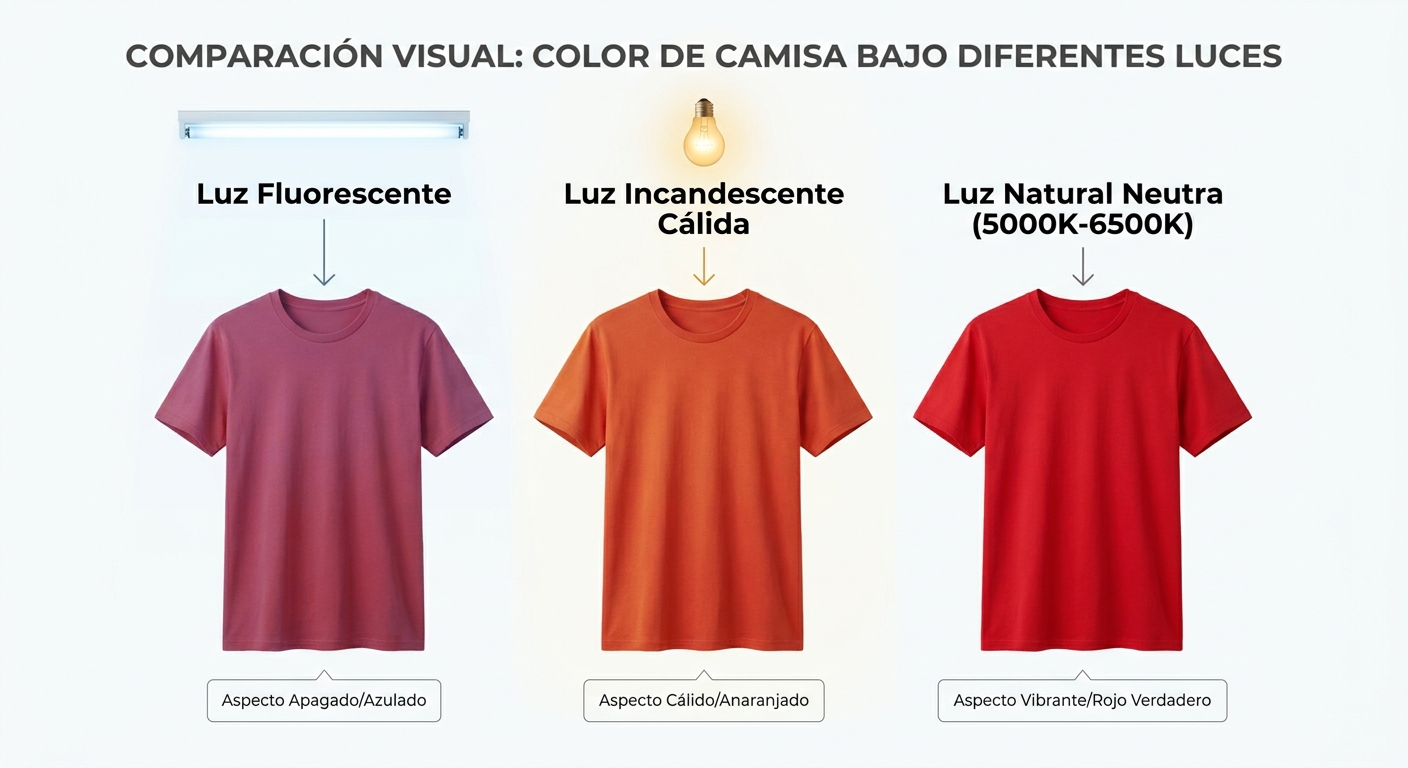
Think about how different your favorite red shirt looks under bright fluorescent lights at the office versus the warm glow of a sunset. It’s the same shirt, but the light source completely changes its appearance. Our perception of color isn’t just about the object itself; it’s a complex interplay between the object, our eyes, and the light illuminating it.
When you’re trying to determine if someone has warm or cool undertones, or if a particular shade makes their skin look clear or dull, you need to see the truest version of that color against their skin. Any distortion from poor lighting can lead to inaccurate results, which means recommending colors that don’t truly flatter.
Understanding Color Temperature and Its Impact
Light isn’t just “on” or “off”; it has a temperature, measured in Kelvin (K). This temperature describes how warm or cool the light appears. Imagine a candle flame (very warm, around 1800K) versus a clear blue sky (very cool, around 10,000K). Most artificial light sources fall somewhere in between.
- Warm Light (lower Kelvin): Often appears yellowish or orange. Think incandescent bulbs, traditional lamplight, or a cozy fireplace. This kind of light can make cool skin tones look warmer than they are, and can mute the vibrancy of cool colors.
- Cool Light (higher Kelvin): Appears bluish-white. Fluorescent lights in an office, some LED bulbs, or very bright overcast days can have this quality. Cool light can make warm skin tones appear sallow or greenish, and can make warm colors seem less rich.
- Neutral Light (around 5000K-6500K): This is the sweet spot for color analysis. It mimics natural daylight without the direct sun’s harshness or the sky’s blue tint. It allows you to see colors as they truly are, without adding its own bias.
If you’re trying to figure out if someone is a Bright Spring or a Deep Winter, and your light source is casting a yellow glow, you might misinterpret their undertones or the clarity of their best colors. This is why getting the light right is paramount.
The Gold Standard: Natural Daylight for Accurate Draping

When it comes to color analysis, natural daylight is generally considered the best light source. But “natural daylight” isn’t just any light from the sun. The ideal scenario is indirect, consistent natural light.
Finding the Perfect Natural Light Spot
Imagine a room with a large window, but not one where the direct sun streams in and creates harsh shadows. A north-facing window is often ideal because it provides consistent, soft, and indirect light throughout the day. East-facing windows are great in the morning, and west-facing in the afternoon, but they can get direct sun at certain times. South-facing windows often get too much direct sun, which can be overly bright and create too much contrast.
- Avoid Direct Sunlight: Direct sun is too strong. It washes out colors, creates harsh shadows, and can even change the perception of undertones. Think about how different colors look at noon versus late afternoon – the light changes dramatically.
- Seek Consistent Illumination: Overcast days are actually fantastic for color analysis because the clouds act as a giant diffuser, spreading even, neutral light. If it’s a sunny day, move your client away from the direct sun, perhaps a few feet back from the window, or use sheer curtains to diffuse the light.
- Mind the Reflections: Be aware of any colored walls, furniture, or even clothing you or your client are wearing that might cast a color reflection onto their face. These reflections can subtly alter skin tone perception. A neutral background (white, gray, or beige) is always best.
A good setup often involves positioning your client facing a window, ensuring the light illuminates their face evenly without creating shadows under their nose or chin. This allows you to clearly see how each fabric drape interacts with their natural coloring.
When Natural Light Isn’t Enough: Professional Color Analysis Lighting Solutions
Let’s be real: not everyone has a perfect north-facing studio with ideal natural light all day, every day. Sometimes, you’re doing consultations in the evening, on a rainy day, or in a space without great windows. That’s where professional artificial lighting comes in.
The goal with artificial lighting is to mimic that ideal neutral daylight (around 5000K-6500K) as closely as possible. You want bulbs with a high Color Rendering Index (CRI).
What is Color Rendering Index (CRI)?
CRI is a measure of how accurately a light source reveals the true colors of objects compared to natural light. A CRI of 100 is perfect, like natural sunlight. For color analysis, you want a CRI of 90 or higher. Anything lower can make colors look dull, distorted, or simply “off.”
Imagine a light with a low CRI. It might make a vibrant red look brownish, or a crisp blue look muddy. This is disastrous for color analysis, where subtle distinctions in hue, value, and chroma are everything.
Types of Artificial Lights to Consider
- Full-Spectrum LED Lights: These are often the go-to for professionals. Look for LEDs specifically labeled “daylight balanced” (around 5000K-6500K) and with a CRI of 90+. They are energy-efficient, long-lasting, and don’t produce a lot of heat.
- Dimmable Lights: Having dimmable options can be incredibly useful. Sometimes, even “neutral” light can feel a bit too intense. Being able to adjust the brightness allows you to create the most comfortable and accurate environment for your client.
- Portable Ring Lights or Softboxes: For mobile stylists or those with limited space, a good quality ring light or a small softbox can provide excellent, even illumination. Just ensure they meet the CRI and Kelvin temperature requirements. Position them to avoid harsh shadows and glare.
Avoid standard household incandescent bulbs (too warm), typical office fluorescents (often too cool and low CRI), and any light source that visibly casts a color tint. Your goal is a clean, neutral canvas of light.
Setting Up Your Studio for Optimal Lighting Conditions
Whether you’re relying on natural light or supplementing with artificial sources, your studio setup plays a huge role in the accuracy of your color analysis sessions. Here’s how to create the best environment:
- Neutral Walls and Background: This is critical. White, light gray, or a very pale neutral beige are your best friends. Avoid brightly colored walls, patterned wallpaper, or even vibrant artwork near your client. These can reflect their own colors onto the client’s skin, skewing your perception of their undertones.
- Client Positioning: Always position your client facing the light source, whether it’s a window or an artificial light. This ensures their face is evenly illuminated, and minimizes shadows that can hide subtle color reactions.
- Your Position: As the consultant, you should also be facing the light source, or at least have it illuminating both you and your client evenly. This prevents you from casting shadows and ensures you’re seeing the same light your client is.
- Mirror Placement: Use a large, high-quality mirror so your client can see themselves clearly. Ensure the mirror is positioned so it also reflects the neutral light onto their face, not a shadowed area of the room. Using color analysis frames can help focus the eye and isolate the face from background distractions, enhancing the impact of good lighting.
- Eliminate Distractions: Turn off any other ambient lights that might be casting a different color temperature. Close blinds on windows that aren’t providing ideal light. The more controlled your environment, the more accurate your results will be.
Checklist for Your Color Analysis Lighting Setup:
| Factor | Ideal Condition | Why it Matters |
|---|---|---|
| Light Source Type | Indirect Natural Daylight OR Full-Spectrum LED (5000K-6500K) | Ensures colors are seen without artificial warmth or coolness. |
| Color Rendering Index (CRI) | 90+ | Guarantees colors are accurately represented, not dulled or distorted. |
| Light Direction | Evenly illuminates client’s face from the front (or slightly above). | Prevents shadows that can obscure skin tone and color reactions. |
| Background | Neutral (white, light gray, pale beige) | Avoids color casts or reflections onto the client’s skin. |
| Reflections | Minimal from walls, clothing, or other objects. | Prevents subtle color changes that can mislead analysis. |
| Consistency | Stable light, not fluctuating in brightness or color. | Allows for reliable comparisons between drapes. |
Common Lighting Mistakes to Avoid
Even with the best intentions, it’s easy to fall into some common lighting traps that can throw off your color analysis. Here are a few to watch out for:
- Using Overhead Recessed Lights: These often cast shadows under the eyes, nose, and chin, making a client look tired or creating artificial contours. This isn’t helpful when you’re trying to see their natural glow.
- Mixing Light Sources: Combining warm incandescent light with cool fluorescent light creates a confusing and often contradictory color environment. Stick to one type of light source with a consistent color temperature.
- Standing Between the Light and Your Client: This might seem obvious, but in the flow of a consultation, you might inadvertently block the light, casting a shadow on your client’s face. Be mindful of your positioning.
- Relying Solely on a Bright Window on a Sunny Day: As mentioned, direct sunlight is too harsh. Even if it’s “natural,” it’s not ideal. Always diffuse it or move your client further back.
- Ignoring the Time of Day: Natural light changes throughout the day. What’s perfect at 10 AM might be too dim or too harsh by 3 PM. Be flexible and adjust your setup as needed, or schedule consultations during optimal times.
Understanding these pitfalls helps you create a more professional and accurate experience for your clients, ensuring that the results of their personal color analysis are truly transformative.
Beyond the Studio: Everyday Lighting for Your Personal Style
While studio lighting is crucial for professional consultations, the principles of good lighting extend to your everyday life. Knowing how different lights affect your appearance can help you make better choices when shopping for clothes, applying makeup, or even taking photos.
Have you ever bought a foundation that looked perfect in the department store, only to realize it was the wrong shade once you got home? That’s a classic case of bad lighting tricking your eyes. Department store lighting is often designed to make everything look appealing, not necessarily accurate. Knowing your best colors means nothing if you can’t see them clearly.
When trying on clothes, always try to step into natural light near a window, or find a well-lit mirror that uses neutral light. If you’re buying makeup, test shades on your jawline and then step outside or near a window to see the true color. This small habit can save you from countless fashion regrets.
For more insights into understanding your personal color analysis and how to apply it, consider exploring resources like Wikipedia’s entry on Personal Color Analysis, which offers a broad overview of the methodology.
The Element & Style USA Difference: Tools for Accurate Analysis
At Element & Style USA, we understand that accurate color analysis starts with the right tools and the right environment. Our professional color analysis drapes are meticulously crafted to provide clear, true-to-color samples, but even the best drapes need the right light to shine. That’s why we emphasize the importance of good color analysis lighting.
Whether you’re a seasoned image consultant or just starting your journey into personal color, investing in your lighting setup is an investment in accuracy, professionalism, and ultimately, client satisfaction. By mastering the art of illumination, you ensure that every color decision is made with confidence, leading to truly transformative style recommendations.