Picture this: you’re three minutes into a consultation, your client is sitting in north-facing light, and you’re holding up a peach drape against her jawline. Her eyes flick to your earring, then to the window, then to the painting behind you. The whole read is contaminated before you’ve even started. That’s the exact moment professionals reach for color analysis frames — the rigid, neutral-bordered tool that isolates the face and makes the right answer obvious instead of debatable.
If you’ve been draping by eye for years and trusting your gut, frames feel like cheating at first. Then you use them once, and you wonder how you ever worked without them. Let’s talk about why.
What color analysis frames actually do
A frame is a rigid panel — usually foam board or a similar lightweight rigid backing — with a face-sized opening cut out of the center. The border is a neutral gray (sometimes white or black, depending on the system you’re trained in). You hold the frame up so your client’s face shows through the opening, then layer drapes behind it or attach swatches around the edge.
The magic is in what the frame removes from view. Your client’s hair color, their sweater, the wall behind them, your own outfit — gone. Their face floats in a neutral field. Suddenly the only thing competing for your attention is the drape you’re testing and the skin you’re testing it against.
Why the human eye needs the assist
Color perception is relational. A peach drape next to a coral wall reads completely differently than the same peach drape next to gray. This is called simultaneous contrast, and it’s the reason two stylists can drape the same client and disagree on whether she’s a warm spring or a soft autumn. Both are reading honest signals — they’re just reading them through different visual noise.
Frames cut the noise. Color constancy is what your brain does to compensate for shifting light and surrounding colors, and while it’s helpful in daily life, it actively works against accurate draping. A neutral gray frame gives your eye a stable reference point so your brain stops compensating and starts seeing what’s actually there.
The case for adding frames to your kit
If you already own a full drape set, you might be wondering whether frames are a nice-to-have or a real upgrade. Honest answer: it depends on how you work and who you serve. Here’s where frames consistently earn their keep.
- Mobile consultations. If you travel to clients’ homes, you can’t control their wall color, the lampshade tint, or the orange throw on the couch. A frame travels with you and gives you a consistent neutral surround everywhere you go.
- Studio sessions with photo documentation. When you photograph the final result for the client’s takeaway, frames create a clean, professional image with no visual clutter behind the face.
- Training and second opinions. If you’re mentoring junior consultants or collaborating on tricky reads, frames make it possible for two people to look at the same face and the same drape and actually see the same thing.
- Borderline seasons. Clients who sit between soft summer and soft autumn, or bright spring and bright winter, are where frames pay for themselves in a single session. The reduced noise makes subtle shifts in skin readable.
What frames are not
Frames don’t replace drapes. They don’t replace good lighting. They don’t replace your trained eye. A frame is a precision instrument that makes your existing skills sharper — it doesn’t substitute for them. If you’re new to draping and hoping a frame will tell you what season your client is, you’ll be disappointed. The drapes still do the talking. The frame just makes sure you hear them clearly.
How do you know if you need professional color analysis frames?
Quick self-check. If two or more of these are true for you, frames will change your work.
- You’ve ever finished a session feeling 80% sure instead of 95% sure.
- You consult in spaces you don’t control — clients’ homes, hotel suites, pop-up events.
- You photograph results and the background is distracting in the final image.
- You’ve had a client question your read because “the drape looked weird against my hair.”
- You’re moving from a four-season system to a 12-season or 16-season system and need finer discrimination.
- You’re charging premium prices and your tool kit doesn’t yet look premium.
That last one matters more than people admit. Clients paying $300+ for a session register the tools you bring. A rigid, professional frame communicates expertise before you’ve said a word. A stack of loose fabric squares pulled from a tote bag communicates something else.
Choosing the right frame for your practice
Not all frames are built the same. Here’s what to look at before you buy.
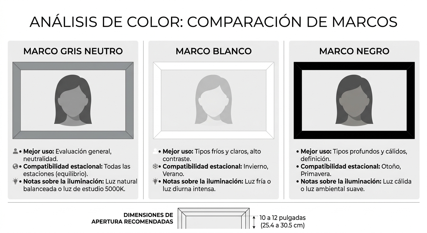
Border color
Neutral gray is the standard for a reason — it doesn’t push warm or cool, doesn’t add value contamination, and reads accurately under most light sources. Some practitioners prefer white frames for bright-season reads or black frames for deep-season clients, but if you’re buying one frame, gray is the safest call.
Opening size and shape
The opening should comfortably show the full face from forehead to collarbone, with a little room around the jawline. Too small and you can’t see the neck, where a lot of undertone information lives. Too large and you lose the noise-cancelling benefit. A standard adult opening runs roughly 10 to 12 inches tall.
Material and rigidity
Rigid foam board is the workhorse material — light enough to hold steady for a 45-minute session, sturdy enough to survive being slid in and out of a tote. Flimsy frames flex when you hold them, which means the angle of the border shifts relative to the face and reintroduces the very inconsistency you bought the frame to eliminate.
Compatibility with your drape system
If you work with a 12-season or 16-season drape set, make sure the frame plays well with how you present drapes — over the shoulder, against the chest, or as swatches clipped to the edge. Some frames have slots or magnetic strips for swatches; others are clean panels you layer behind. Match the tool to your workflow, not the other way around.
How to actually use frames in a session
Owning a frame and using it well are different things. Here’s a clean workflow that respects the client’s experience and gets you accurate reads.
Step 1: Prep the space
Even with a frame, lighting still matters. Use full-spectrum daylight bulbs (5000K to 5500K) or work near a north-facing window between mid-morning and mid-afternoon. Remove your own jewelry and wear a neutral gray or off-white top. Strip the client’s makeup — at minimum, lipstick and blush — and pull hair back with a neutral band or cape.
Step 2: Position the frame
Hold the frame about 6 to 8 inches in front of the client’s face, parallel to the plane of their face, not tilted. The border should fully surround the visible skin. Ask the client to look straight ahead at a fixed point — not at you, not at the drape. Their gaze affects how their face muscles sit, which affects how light reflects off their skin.
Step 3: Test in pairs
Never show a single drape in isolation. The eye needs comparison. Show two drapes back to back — say, a warm coral and a cool pink — and watch what happens to the skin around the mouth, under the eyes, and along the jaw. With a frame controlling the surround, the difference between “this lifts the face” and “this drags it down” becomes much easier to see.
Step 4: Document with the frame in place
Snap a photo with the winning drape behind the frame. You now have a clean, repeatable visual reference for the client’s palette card or digital deliverable. No distracting backgrounds, no inconsistent lighting from shot to shot.
Frames vs. other diagnostic aids
Where do frames fit in the broader toolkit? Here’s a quick comparison.
| Tool | Primary job | Best for | Limitation |
|---|---|---|---|
| Drapes | Test skin response to specific colors | The core read — season and subseason | Subject to surrounding visual noise |
| Color analysis frames | Isolate the face from background distractions | Mobile work, borderline reads, photo documentation | Doesn’t replace drapes |
| Neutral cape | Block client’s clothing from view | Every session, no exceptions | Doesn’t address background or hair |
| Daylight bulbs | Standardize light source | Studio practice | Not portable in all setups |
| Hair band/cape | Remove hair color from the read | Clients with high-contrast or dyed hair | Some clients dislike the look mid-session |
Read across the table and you’ll notice that no single tool does everything. Frames sit in the middle of the kit, doing one specific job — controlling the visual surround — better than anything else.
Real session, real difference
A consultant I know in Atlanta took on a client last spring who’d been typed three different ways by three different stylists: light summer, soft summer, and soft autumn. The client arrived skeptical, a little tired of the process, and convinced color analysis didn’t work for her.
The consultant set up with frames for the first time that month. Within ten minutes of draping, the soft summer read was unmistakable — not because the drapes were different from what other stylists had used, but because the frame made the warm options visibly drag the client’s skin in a way that hadn’t been obvious in earlier sessions held in busier rooms. The client could see it too, in real time, which is the other quiet benefit of frames: they make the read visible to the person being draped, not just the person doing the draping.
That kind of client experience is why frames are increasingly standard in professional color analysis kits sold to working consultants.
Common mistakes to avoid
Even good tools get misused. Watch for these.
- Holding the frame too close to the face. It crowds the client and casts a slight shadow. Six to eight inches is the sweet spot.
- Skipping the makeup removal step because you have a frame. The frame controls the surround, not the face itself. Foundation, blush, and lipstick still distort the read.
- Using a frame in poor light and assuming it’ll compensate. It won’t. Garbage light in, garbage read out.
- Forgetting to test in pairs. A frame is a comparison tool, and comparison requires at least two drapes side by side.
- Buying a frame and never updating your draping protocol. If your workflow doesn’t change to take advantage of the frame, you’ve just bought a fancy piece of foam board.
Building a frame-ready studio on a budget
You don’t need a $5,000 studio to use frames well. Here’s a minimum-viable setup that delivers professional results.
- One rigid gray frame sized for adult faces.
- A 12-season drape set in standard fabric weights.
- Two full-spectrum daylight bulbs in adjustable lamps, positioned at 45-degree angles to the client.
- A neutral gray cape or large drape for blocking the client’s clothing.
- A simple neutral hair wrap or band.
- A phone or camera on a small tripod for documentation.
That’s it. Total investment well under what most consultants charge for two sessions, and it’ll serve you for years. If you want to scale up later — additional frames for varied border colors, a dedicated photography backdrop, motorized swatch displays — that’s all optional polish. The list above gets you to professional output.
When frames matter most: the borderline client
The clearest case for investing in color analysis frames is the client who lives at the edge between two seasons. About one in four clients sits cleanly in the middle of their season. The rest land somewhere on a spectrum — closer to soft autumn but flirting with soft summer, or a deep winter who could pass for a cool winter on the right day.
For these clients, the difference between the right palette and the close-but-wrong palette comes down to small visual cues: a barely-there yellowing under the jaw, a slight dullness around the eyes, a flush across the cheek that lifts or sinks the face. You can’t see those cues if a busy background is fighting for your attention. Frames let you see them. That’s the whole pitch.
A few words on training and trust
Tools amplify skill — they don’t create it. If you’re early in your career, invest in training first, drapes second, frames third. The order matters because frames make subtle differences visible, and you need to know what those subtle differences mean before they’re useful to you. The Association of Image Consultants International is a solid starting point for US-based consultants looking to build credentials.
Once you’re comfortable reading drapes confidently in controlled conditions, adding frames is the next logical step. You’ll find your sessions get shorter, your reads get sharper, and your client confidence climbs — not because the frame is doing the work, but because it’s letting you do yours.
Closing thought
The best tool in your kit is the one that disappears in use — the one you stop thinking about because it just works. Good color analysis frames earn that status fast. They’re not flashy, they don’t promise miracles, and they don’t replace the years you’ve spent learning to read skin. They just clear the noise so the work you already do well becomes unmistakable to you, to your client, and to anyone watching over your shoulder.
If you’ve been working without frames and your sessions are getting more complex — more borderline clients, more travel, more documentation — it might be time to add one to your kit. Browse the made-to-order frames and drape sets built specifically for working consultants, and see what changes in your next session. The difference shows up faster than you’d expect.