
You know that one friend who looks incredible in mustard yellow, while the same sweater makes you look like you’ve been awake for 72 hours? That’s not a wardrobe failure. That’s undertone at work — and once you understand whether you have a warm or cool undertone, half the mystery of “why does she look so good in that?” gets solved.
Figuring out your undertone is the foundation of color analysis. It’s the first question every stylist asks before they reach for the drapes, and it’s the answer that quietly explains why some colors light you up and others wash you out. Let’s walk through how to tell them apart, in plain language, with the kinds of tricks that actually work in your bathroom mirror.
What undertone actually means (and what it doesn’t)
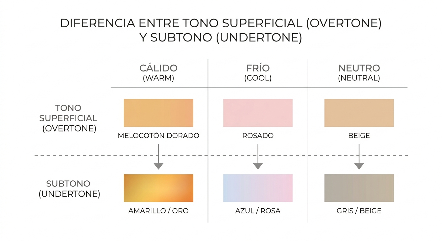
Your overtone is the surface color of your skin — the part that tans, freckles, flushes, or fades depending on the season. Your undertone is the steady hue underneath, the one that doesn’t budge no matter how much sun you’ve seen. Two people with nearly identical surface tones can have completely different undertones, which is why generic color advice (“redheads should wear green!”) falls apart so often.
Undertones generally fall into three buckets: warm, cool, and neutral. Warm undertones lean golden, peachy, or yellow. Cool undertones lean pink, red, or bluish. Neutral undertones sit in between, borrowing from both sides. The goal of color analysis is to figure out which family you belong to so that every shirt, lipstick, and pair of earrings you own can quietly do the heavy lifting for your complexion.
Why undertone beats “skin color” every time
People often try to pick colors based on whether their skin is light, medium, or deep. That matters too — it’s called value in color theory — but undertone is the lead actor. A deep complexion with a cool undertone glows in icy berry tones. A deep complexion with a warm undertone comes alive in burnt orange and olive. Same skin depth, totally different palettes. If you’ve ever bought a foundation that looked right in the bottle and chalky on your face, you’ve already met undertone in person.
How do you know if you have a warm or cool undertone?
Here’s the honest part: there’s no single test that works for everyone. The trick is to run three or four small experiments and look for the pattern. One result might mislead you. Three pointing the same direction? That’s your answer.
The vein test (with a caveat)
Turn your wrist over in natural daylight — not under a yellow bulb, not in front of a window with colored curtains. Look at the veins on the inside of your forearm.
- Greenish veins: usually a warm undertone.
- Blue or purple veins: usually a cool undertone.
- A mix, or hard to tell: likely neutral.
The caveat: this test is famous because it’s easy, not because it’s foolproof. Vein color depends on skin thickness and how close the veins sit to the surface. Use it as one clue, not the verdict.
The jewelry test
Pull out a gold piece and a silver piece — earrings, a chain, even a kitchen spoon if that’s what’s nearby. Hold each one up to your bare face in daylight, ideally without makeup.
- If gold makes your skin look lit-from-within and silver looks flat or grayish, you’re warm.
- If silver brightens you and gold looks muddy or yellow against your skin, you’re cool.
- If both look great (lucky you), you’re likely neutral.
This test works because metals are essentially shiny color drapes. Gold reflects warm light back into your face; silver reflects cool light. Whichever one harmonizes is telling you something true.
The white paper test
Grab a sheet of bright white printer paper and hold it next to your bare-faced cheek in front of a window. Look at the contrast between the paper and your skin.
- If your skin looks yellowish, peachy, or golden next to the paper — warm.
- If your skin looks pink, rosy, or slightly blue — cool.
- If you mostly see gray or beige with no clear lean — neutral.
This one is surprisingly powerful because the paper acts as a true neutral reference. Your eye stops adjusting and finally sees what’s actually there.
The sun test
How does your skin react to sun exposure? It’s not a perfect indicator, but it’s a useful tiebreaker.
- Tans easily, rarely burns: often warm.
- Burns first, then maybe tans: often cool.
- Burns then tans reliably: often neutral.
Yes, there are exceptions everywhere. Genetics is messy. But combined with the other tests, sun behavior adds one more data point.
What a warm undertone looks like in real life
Warm undertones carry hints of yellow, peach, gold, or honey. They show up across every skin depth — from very fair Irish complexions with golden freckles, to olive Mediterranean and Latin skin, to deep brown skin with red or copper warmth underneath. If you’ve ever been told you have a “sunny” complexion, or your foundation shade has “golden,” “honey,” “caramel,” or “warm” in the name, that’s a strong hint.
Colors that tend to flatter warm undertones
- Warm reds (think tomato, brick, terracotta)
- Mustard, camel, and caramel
- Olive, moss, and warm forest greens
- Peach, coral, and warm corals leaning orange
- Cream and ivory instead of stark white
- Chocolate, espresso, and warm browns
Colors that tend to fight warm undertones
- Icy pastels (baby pink, mint, periwinkle)
- Pure black close to the face (try chocolate or navy instead)
- Bright fuchsia and magenta
- Cool gray with a blue cast
What a cool undertone looks like in real life
Cool undertones carry hints of pink, red, or blue beneath the surface. Again, this spans the full range of skin depths — from porcelain skin that flushes pink, to medium skin with rosy cheeks, to rich deep skin with cool blue or plum undertones. Foundation shades labeled “rose,” “porcelain,” “cool,” or “neutral-cool” tend to land best.
Colors that tend to flatter cool undertones
- True blues, sapphire, and royal blue
- Emerald and jewel-tone greens
- Berry, raspberry, and cool pinks
- Lavender, plum, and cool purples
- Pure white and crisp gray
- True black and charcoal
Colors that tend to fight cool undertones
- Mustard yellow and orange
- Warm beige and tan (can look sallow)
- Olive green
- Warm ivory and cream (try optic white instead)
What about neutral undertones?
If you tried all four tests and got mixed results, welcome to the neutral club. Neutral undertones can wear a wider range of colors, but they still have a slight lean — usually warm-neutral or cool-neutral. The trick is to avoid the most extreme versions of each family. Skip neon orange and skip icy mint; settle into the middle. Dusty rose, soft teal, mid-tone navy, and muted burgundy tend to be safe homes for neutral undertones.
A side-by-side cheat sheet
| Clue | Warm | Cool | Neutral |
|---|---|---|---|
| Veins | Green | Blue/purple | Mixed |
| Best metal | Gold | Silver | Both |
| Next to white paper | Yellow/peach | Pink/rosy | Beige |
| Sun reaction | Tans easily | Burns first | Burns then tans |
| White t-shirt | Cream looks better | Optic white looks better | Both work |
| Best basic neutral | Camel, chocolate | Gray, navy | Taupe |
The common mistakes that throw people off
Even with the tests above, people often guess wrong on their first try. Usually it’s because of one of these traps.
Mistake 1: Confusing redness with cool undertone
Rosacea, flushing, or post-workout pink isn’t undertone — it’s surface reactivity. Plenty of people with warm undertones flush easily and assume that pinkness means they’re cool. Step away from the redness and check the areas that stay calm: inner forearm, jawline, behind the ear.
Mistake 2: Letting tan skin fool you
A tan adds yellow or brown to your overtone but doesn’t change your underlying hue. If you do your tests in late August, you might read “warm” even if your true undertone is cool. Test in winter when your skin is at its baseline, or test the skin under your upper arm where the sun rarely reaches.
Mistake 3: Trusting one test only
The vein test alone is famously unreliable. Run at least three checks. If three out of four point warm, trust the pattern, not the outlier.
Mistake 4: Doing the test under bad light
Yellow incandescent bulbs make everyone look warm. Cool LED bulbs make everyone look cool. Daylight near a window — not direct sun, just bright indirect light — is the only honest light source for this kind of work.
How professionals confirm your undertone
This is where color analysis goes from bathroom-mirror experiment to actual science. Image consultants and personal stylists use physical fabric drapes — large pieces of cloth in carefully calibrated colors — that they hold under your chin one after another. Within seconds, you can see what foundation, contour, lipstick, and good lighting have been hiding from you for years. A warm drape on a cool person makes the skin look gray, tired, or jaundiced. A cool drape on a warm person makes the skin look ashy and washed out. The right drape, on the right person, makes the eyes pop and the skin look like it slept ten hours.
If you’re a stylist building your practice — or a serious DIY enthusiast who wants to stop guessing — the Four-Season Color Analysis Drape Set is the kind of tool that turns “I think you’re warm?” into a clear answer your client can see for themselves. It covers the four seasonal palettes and gives you a working baseline for warm-versus-cool, light-versus-deep, and bright-versus-muted in one kit.
From undertone to seasonal palette
Once you know you’re warm or cool, you’re halfway to your seasonal color palette. The 12-season system layers three questions on top of each other:
- Undertone: warm or cool?
- Value: do you look better in light or dark colors?
- Chroma: do clear, bright colors flatter you, or muted, dusty ones?
Warm undertones generally land in Spring or Autumn families. Springs lean bright and clear (think coral, peach, warm turquoise). Autumns lean rich and muted (rust, olive, mustard). Cool undertones generally land in Summer or Winter. Summers lean soft and dusty (powder blue, rose, soft lavender). Winters lean clear and high-contrast (emerald, sapphire, true red, ice pink).
You don’t have to memorize all of that today. Just know that the answer to “warm or cool” is the door — everything else opens up from there. If you want a structured walk-through, an análisis de colorimetría y estilo gratuito can help you map your full palette without trial and error.
Practical ways to use your undertone tomorrow morning
Knowing your undertone is only useful if it changes what you wear. Here’s how to put it to work right away.
In your closet
- Pull out the five tops you reach for most. Look at the colors. Notice how many already align with your undertone — usually a lot.
- Identify the “graveyard” pieces — the ones that hang untouched. Hold them up to your face in daylight. Most of them will be from the wrong family.
- When you shop, treat your undertone as the first filter. A cute sweater in the wrong undertone is still the wrong sweater.
In your makeup bag
- Warm undertones: peachy blush, terracotta lip, gold-leaning highlight, warm-brown eyeliner.
- Cool undertones: pink or berry blush, rose or mauve lip, silver or champagne highlight, true black or plum eyeliner.
- Foundation: match to your jawline in daylight. If it disappears, you’ve nailed both shade and undertone.
In your accessories
- Build your jewelry collection around your best metal first, then add the other for variety.
- Bag, belt, and shoe leathers matter too: warm undertones glow next to cognac and camel; cool undertones look sharp in black, gray, and burgundy.
One more honest note
Plenty of people land somewhere between warm and cool and feel frustrated that they can’t get a clean answer. That’s not a personal failing — it’s just biology. Neutral undertones are extremely common, and the work becomes about finding which warm colors and which cool colors flatter you most, rather than picking a team. According to the personal color analysis tradition, the goal was never to box people in. It was to give them a working framework, then let real life — real fabrics on real faces — make the final call.
So try the tests. Stand by a window. Hold up gold and silver. Look at your veins. Notice which white you reach for. The answer to whether you have a warm or cool undertone isn’t hiding — it’s just been waiting for you to look in better light. And once you have it, getting dressed gets quieter, easier, and a lot more flattering. That’s the whole point.