Stand in front of your closet on a Tuesday morning. You reach for the navy sweater again, and the same coral one stays on the hanger — third week in a row. That coral isn’t ugly. It just doesn’t love you back. Learning how to do color analysis at home is really learning to see which colors do love you back, so your morning routine stops feeling like a guessing game.
The good news: you don’t need a studio, a stylist, or a $400 session to get a solid read on your season. You need daylight, a few honest fabrics, a clean face, and about an hour of patience. Here’s the full walkthrough.
What color analysis actually does (in plain English)
Color analysis sorts you into a seasonal palette — Spring, Summer, Autumn, or Winter, with finer subcategories — based on three things your skin, eyes, and hair share: undertone (warm, cool, or neutral), value (how light or dark you read overall), and chroma (how bright or muted your features are). Match a fabric to those three traits and your face looks rested. Mismatch them and you’ll see shadows, redness, or that “is she sick?” tilt.
If you want the encyclopedic version, Wikipedia’s entry on personal color analysis covers the history from Johannes Itten through the Carole Jackson era. For our purposes, we’re skipping theory and going hands-on.
Before you start: set up your space
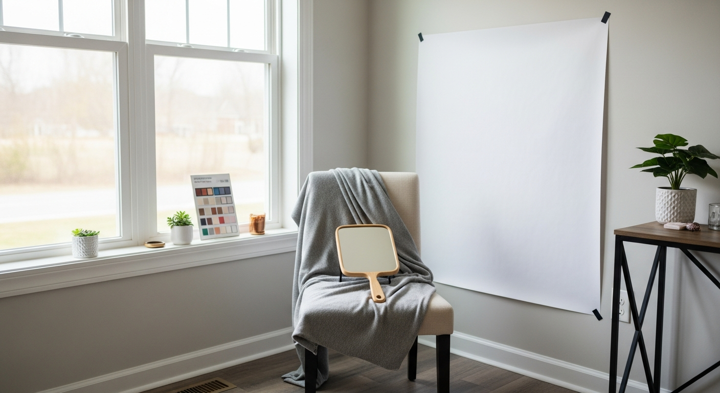
This part matters more than people think. Bad lighting will lie to you, and a busy background will pull the focus off your face. Spend ten minutes getting this right.
Lighting
- Use natural daylight. Mid-morning or early afternoon, indirect sun. North-facing window if you have one.
- Avoid yellow bulbs, fluorescents, and ring lights. They’ll skew everything warm or cool artificially.
- Don’t sit near a colored wall. A lime-green room reflects green onto your skin and ruins the test.
Background and clothing
- Sit in front of a white or light gray wall. A white sheet pinned up works.
- Wear a white or neutral cream top, or drape a white towel over your shoulders so your current shirt doesn’t interfere.
- Tie your hair back. If you color your hair, that’s fine — we’ll work with what’s on your head today, not your “natural” shade from fifth grade.
Face prep
- No makeup. None. Not even tinted moisturizer.
- Skip the test if you’re flushed from a workout, crying, or freshly back from the beach.
- Have a mirror at eye level — handheld is fine, but you want both hands free for fabric.
How to do color analysis at home, step by step

Here’s the sequence. Take your time. Each step builds on the last, and skipping one is how people end up convinced they’re a Winter when they’re actually a Soft Autumn.
Step 1: Find your undertone
Undertone is the underlying hue of your skin — the cast that stays the same whether you’re tan or pale. There are three buckets:
- Warm: yellow, peach, or golden cast
- Cool: pink, red, or bluish cast
- Neutral: a mix, hard to pin down
Try these checks together — no single one is reliable on its own:
- Vein test. In daylight, look at the inside of your wrist. Green-ish veins lean warm, blue or purple lean cool, a mix means neutral.
- Jewelry test. Hold a gold chain and a silver chain near your face. Which one makes your skin look smoother and your eyes brighter? Gold = warm, silver = cool, both look fine = neutral.
- White paper test. Hold a sheet of pure white paper next to your bare face. If your skin looks yellowish against it, you’re warm. Pinkish or rosy, you’re cool. If your face looks gray or sallow, you might be neutral or the lighting is off.
- Sun reaction. Burn easily and rarely tan? Often cool. Tan deeply with little burning? Often warm. Both happen? Neutral is likely.
Write down what you see. Don’t decide yet — undertone is one leg of the stool.
Step 2: Find your value
Value is about contrast. Look in the mirror and squint until your features blur. Ask:
- Is there high contrast between your hair, skin, and eyes? (Dark hair, fair skin, light eyes — think Lucy Liu in certain photos, or Anne Hathaway.)
- Is everything low contrast and blended? (Soft brown hair, medium skin, hazel eyes all reading similarly — think Jennifer Aniston, Zoe Kravitz in natural light.)
- Or somewhere in between?
High-contrast people generally suit Winter or Bright Spring palettes. Low-contrast people lean Summer or Soft Autumn. This isn’t a rule, it’s a clue.
Step 3: Find your chroma
Chroma is brightness. Are your features vivid and clear, or soft and dusty? Look at your eyes specifically. Do they have a clear, almost glassy look with a defined pattern? You’re probably bright (Winter or Spring families). Do they look muted, smoky, or blended? You’re probably soft (Summer or Autumn families).
Step 4: Drape testing
This is where it gets real. You’re going to hold actual fabric next to your face and watch what happens. You can use scarves, fabric scraps from a craft store, or a proper drape set if you want consistent, color-accurate results.
For each color, you’re looking for four signals:
- Good: skin looks even, eyes brighten, jawline looks defined, you look rested
- Bad: shadows under eyes, redness pops out, skin looks sallow or gray, features fade
Test in pairs. Hold a warm orange-red next to a cool blue-red. One will obviously win. Then beat the winner against the next contender. It’s a tournament bracket for your face.
Step 5: Narrow to a season
Once you’ve tested across all four seasonal families, the patterns emerge. Use this quick reference:
| Season | Undertone | Value | Chroma | Best colors |
|---|---|---|---|---|
| Spring | Warm | Light to medium | Bright | Coral, peach, warm turquoise, ivory |
| Summer | Cool | Light to medium | Soft | Powder blue, rose, soft lavender, pewter |
| Autumn | Warm | Medium to deep | Soft | Olive, rust, mustard, terracotta, camel |
| Winter | Cool | Deep (or high contrast) | Bright | True red, emerald, icy pink, pure white, black |
How do you know if you got it right?
You’ll know because the test isn’t subtle once you’ve done it a few times. The right colors do three specific things almost every time:
- Your skin looks like it has its own light source. Redness softens, under-eye shadows recede.
- Your eye color seems to deepen or sparkle — not in a sparkly-eyeshadow way, in a “huh, her eyes are really green” way.
- People comment on you, not on your shirt. “You look great today” instead of “cute top.”
The wrong colors do the opposite, and they’re easier to spot. If a drape makes you look tired, that’s a hard no. Trust that feeling — it’s information, not insecurity.
What if two seasons look almost equally good?
Welcome to the 12-season system. Most people land between two pure seasons, in what’s called a “flow” category. A Soft Autumn flows into Soft Summer; a Bright Spring flows into Bright Winter. If your tests show this, you’re not failing — you’re neutral-leaning, and you have a wider workable palette. Pick whichever side has more “yes” colors and call it home.
The tools that actually help (and what you can skip)
You can absolutely DIY this with scarves from your closet. But the results get noticeably more reliable when the test fabrics are color-accurate, similar in size, and presented against a neutral backdrop.
What to gather from home
- A white pillowcase or sheet for backdrop
- A white towel to cover your current outfit
- Scarves, fabric scraps, or large color swatches in a variety of hues
- A good mirror in daylight
- A notebook to log your reactions
What’s worth investing in
If you do this for yourself once, scarves are fine. If you want to test friends and family, or you’re a stylist building a service, a proper kit pays for itself fast. A Four-Season Color Analysis Drape Set ($119) gives you calibrated fabrics across all four seasonal families, sized to fall correctly across the shoulders. The difference between guessing with a craft-store scarf and draping with a real set is the same as the difference between a phone flashlight and a salon lamp — both technically work, only one tells the truth.
Common mistakes when doing color analysis at home
Most home tests go sideways for the same handful of reasons. Watch for these:
- Testing in bathroom lighting. Vanity bulbs are almost always warm-biased. You’ll think everyone’s an Autumn.
- Wearing makeup. Even “neutral” foundation neutralizes the very signal you’re trying to read.
- Testing too few colors. If you only try blue and red, you’ll get a binary answer that ignores nuance. Aim for at least 16 fabrics across all four families.
- Confusing “I like this color” with “this color likes me.” Your favorite color in the abstract may not be your best near your face. That’s why we test on the face, not on the body.
- Doing it alone the first time. A second pair of eyes catches what you’ll talk yourself out of. Grab a friend.
- Deciding based on one drape. Always compare. Single fabrics in isolation lie.
Putting your palette to work

Knowing your season is the start, not the finish. The real payoff is in how you shop and how you dress.
Your “near the face” rule
Strict palette adherence matters most for anything close to your face: tops, scarves, jackets, jewelry, lipstick, eyeglass frames, hair color. Pants, shoes, and bags? Looser rules. A Winter can absolutely wear camel pants — just pair them with a true-red or crisp-white top.
Build a capsule around your best 8 colors
Once you know your season, pull eight colors that flatter you most and use them as the spine of your wardrobe. Pieces in those eight will mix easily, photograph well, and make getting dressed faster. Add neutrals from your palette (yours might be ivory and camel, or pure white and charcoal — they’re not universal).
Lipstick is the cheap shortcut
If you only change one thing after analyzing your colors, change your lipstick. A Summer in a brick-red lip looks washed out; the same person in a soft rose looks ten years younger. A Spring in mauve looks ashy; in coral, lit up. It’s a $20 experiment with outsized results.
When to bring in a pro
DIY gets you 80% of the way. The last 20% — pinning down your subseason, sorting out which neutral is yours, deciding between Soft Summer and Soft Autumn — is where a trained eye saves time. If you’ve done the home test and still feel uncertain, or if you want a personalized swatch wallet to shop with, book a session with an image consultant. The Association of Image Consultants International has a US directory of certified professionals.
If you’re curious about a guided experience, our team offers an análisis de colorimetría y estilo gratuito as a starting point — useful even after you’ve done the home work.
A realistic timeline for the whole process
| Step | Time | What you’ll have at the end |
|---|---|---|
| Setup (lighting, space, prep) | 15 min | A clean, daylight-lit testing area |
| Undertone, value, chroma checks | 20 min | A working hypothesis (e.g., “warm, medium, soft”) |
| Drape testing | 30-45 min | A clear winning season |
| Palette download and capsule plan | 30 min | Your top 8 colors and a shopping list |
Under two hours, total. That’s less time than one trip to the mall returning things that didn’t work.
A note on changing seasons over time
Your season is set by underlying biology, but the surface can shift. Going gray can move a Deep Winter toward Cool Summer territory in practice, because the contrast in your features softens. Pregnancy, menopause, and major weight changes can shift skin tone slightly. Re-test every few years, or whenever something feels “off” in colors that used to work. You’re not changing seasons so much as updating the version.
One last reframe
Color analysis isn’t about restriction. It’s about editing. You’re not banned from wearing orange — you’re learning which orange, where, and with what. The Soft Autumn who loves cobalt blue can wear it as pants, with a soft rust top up by her face. The Bright Winter who can’t pull off mustard can still own a mustard handbag. Knowing your palette gives you the permission slip to break the rules on purpose, which is very different from breaking them by accident.
Now you know how to do color analysis at home: set up real daylight, prep your face, work through undertone, value, and chroma, drape-test across all four families, and trust what your face tells you. The first time takes effort. Every time after, you’ll spot your colors in a store from twenty feet away — and that coral sweater that’s been hanging there all year will quietly find its way to the donation pile, no hard feelings.